Context
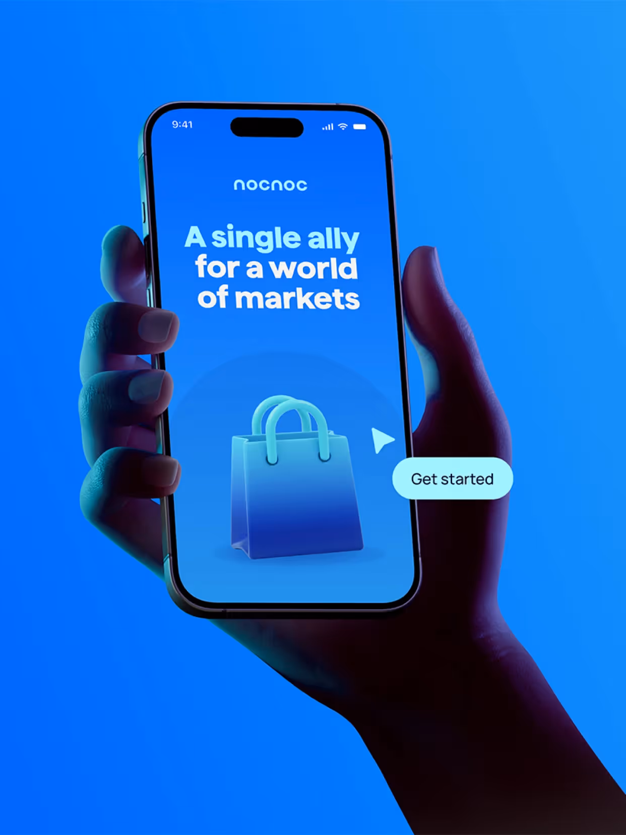
We redesigned nocnoc's identity to support its growth and consolidation as a brand. From addressing a specific aspect of cross-border e-commerce, the company evolved into a comprehensive, robust, and globally expanding solution. The challenge was to translate this maturity into an identity capable of communicating technological strength without losing its human touch, and clearly expressing its role in a complex and highly competitive sector.
Strategy
The redesign stemmed from nocnoc's internal culture, defining the brand through the idea of simplifying the complex. We built a visual system capable of streamlining operations and making them clear. Through a visual language adaptable to multiple markets, nocnoc positions itself as a reliable strategic partner, capable of connecting global brands with the most complex markets in Latin America through a collaborative and expert approach.
Implementation
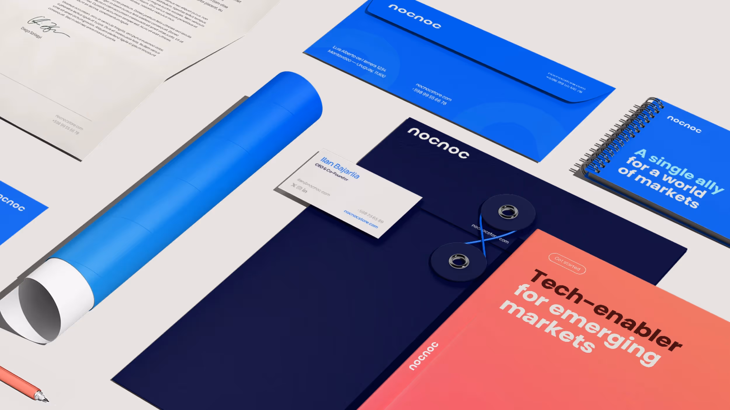
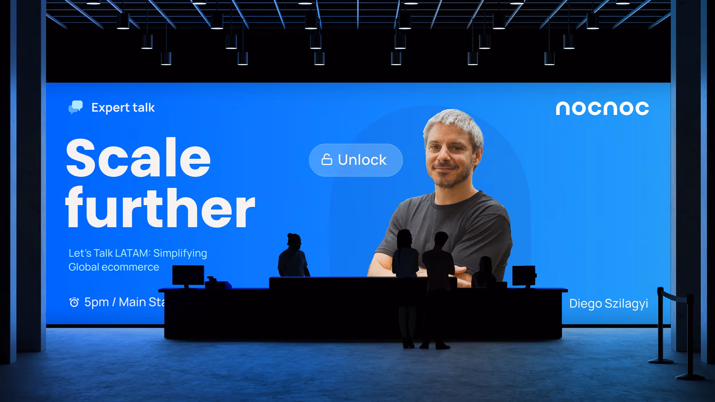
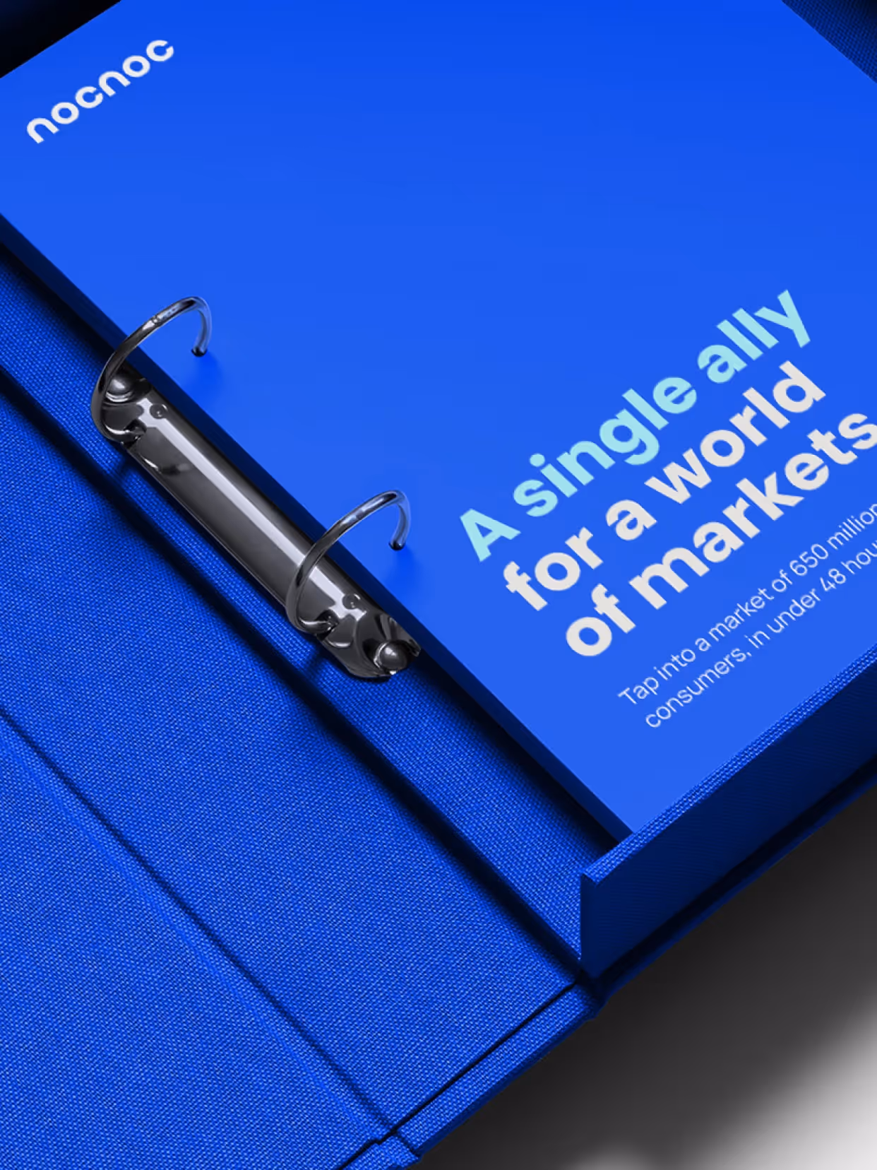
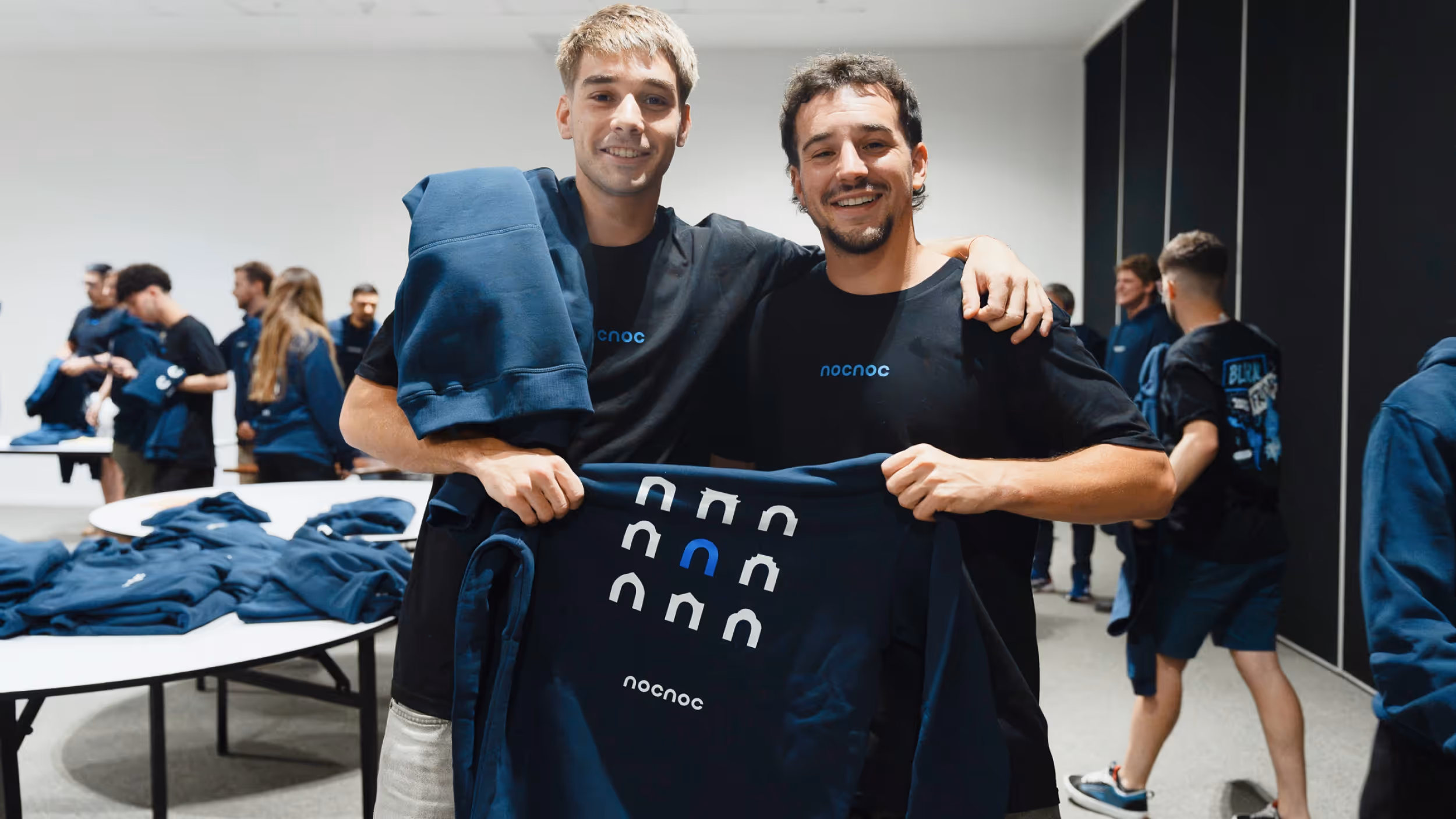
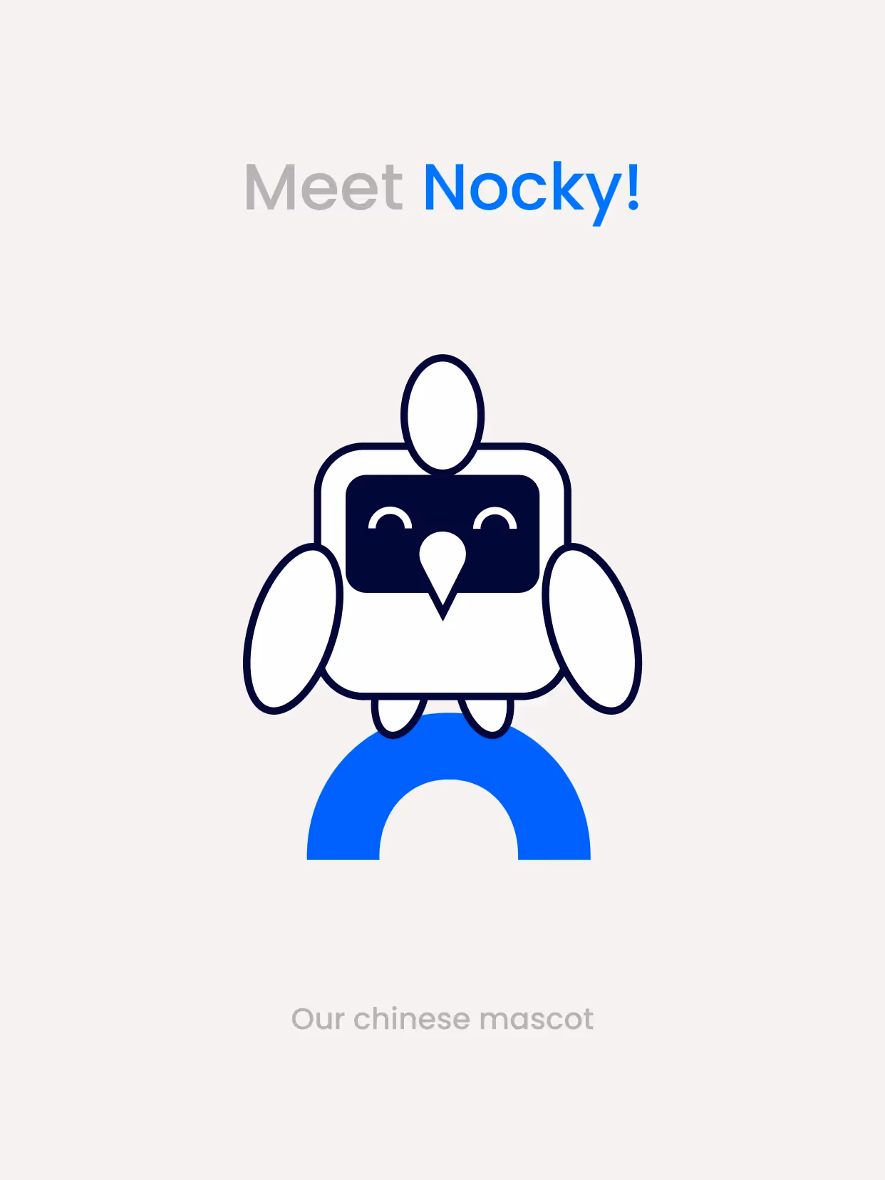
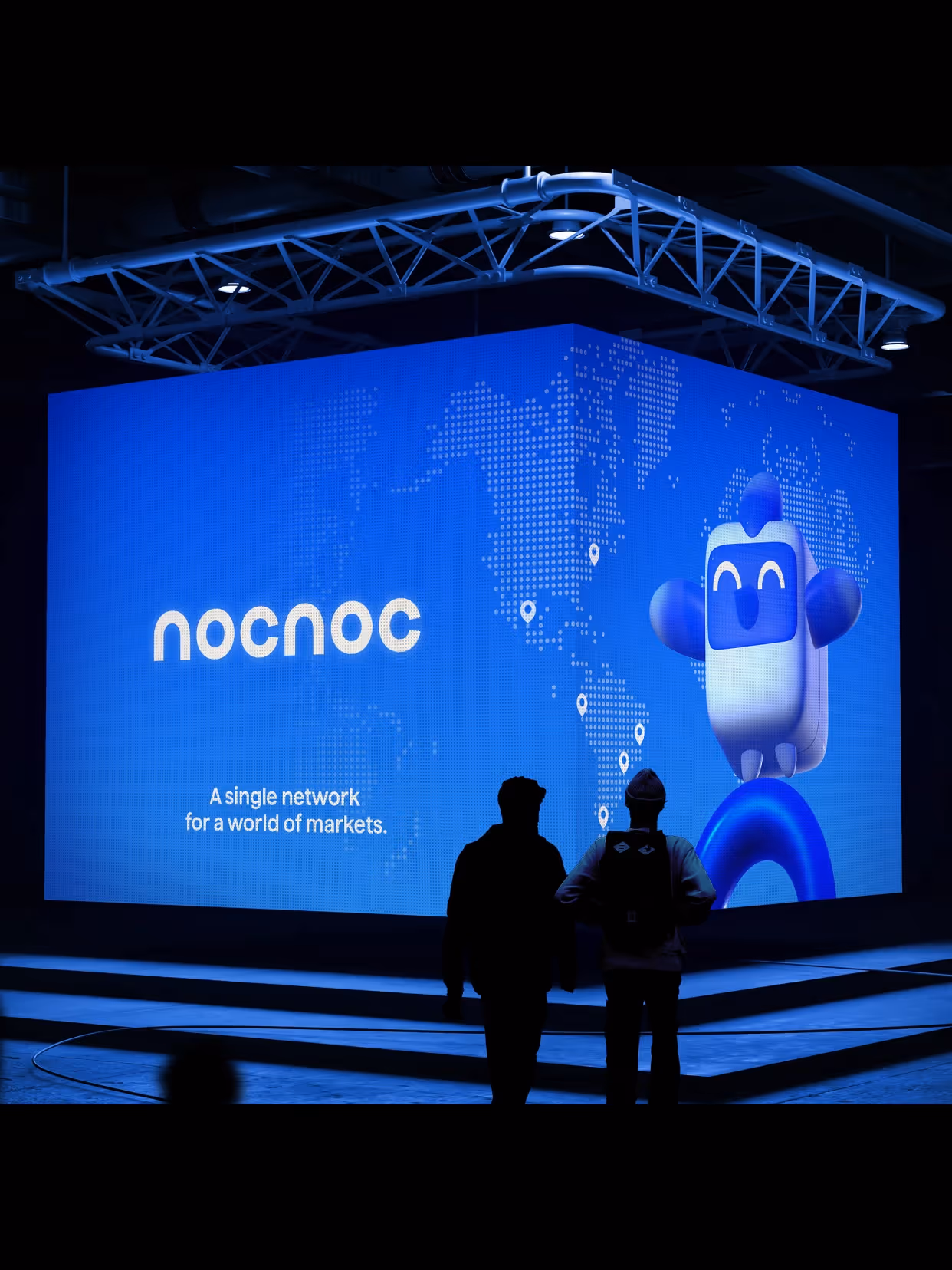
We developed a synthetic and flexible visual system designed to operate in multiple contexts. The identity is structured around a solid primary palette, complemented by a broad secondary palette that adds dynamism. We incorporated a mascot as a cross-cutting element, reinforcing approachability and facilitating international projection. Formally, we introduced the concepts of bridges and arches as graphic resources, alluding to nocnoc's role as a connector between markets. The result is a clear, recognizable language ready to scale.
Result
nocnoc consolidates its position as a strategic bridge between global brands and Latin America. An identity that accompanies its growth and allows it to scale clearly, simplifying complexity.


Credits
Strategy
Beatriz Fernández Cordano
Design
Sofía Lasida, Amparo Bengochea da Fonte, Valentina Vaccotti, Matías Berta, Gabriela Nisizaki
Collaborators
Yubei Dai, Lucía Fuentes, Camila Gómez García
Sound Design
Joaquín Berta
Photography
Alessia Torrini