Context
Nowports is a logistics technology company that connects Latin America to the world through a digital ecosystem. In a context of rapid regional expansion, the challenge was to support its growth without compromising its existing identity, building a system capable of scaling communication, aligning teams, and maintaining consistency across multiple markets.
Strategy
We started with what we had built and evolved it. We defined the brand based on the idea of connection: not only between geographical points, but also between stakeholders, processes, and opportunities. The strategy sought to transform this logic into a sustainable system, capable of adapting over time without losing recognition, reinforcing Nowports as a facilitator of international trade in Latin America.
Implementation
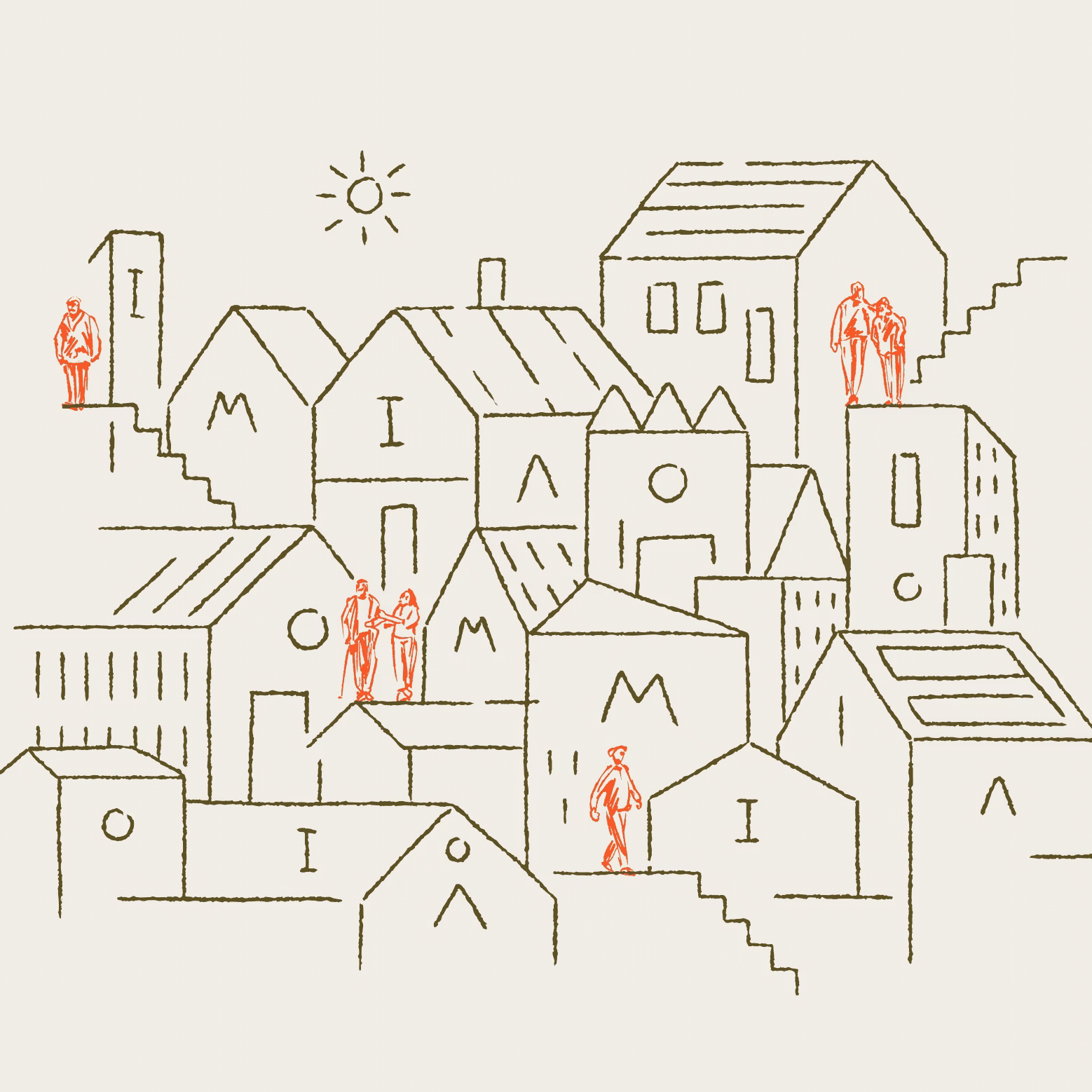
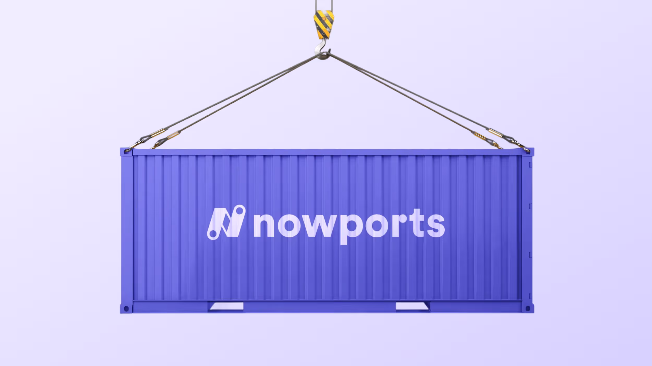
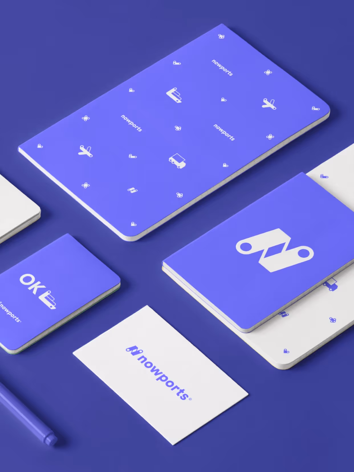
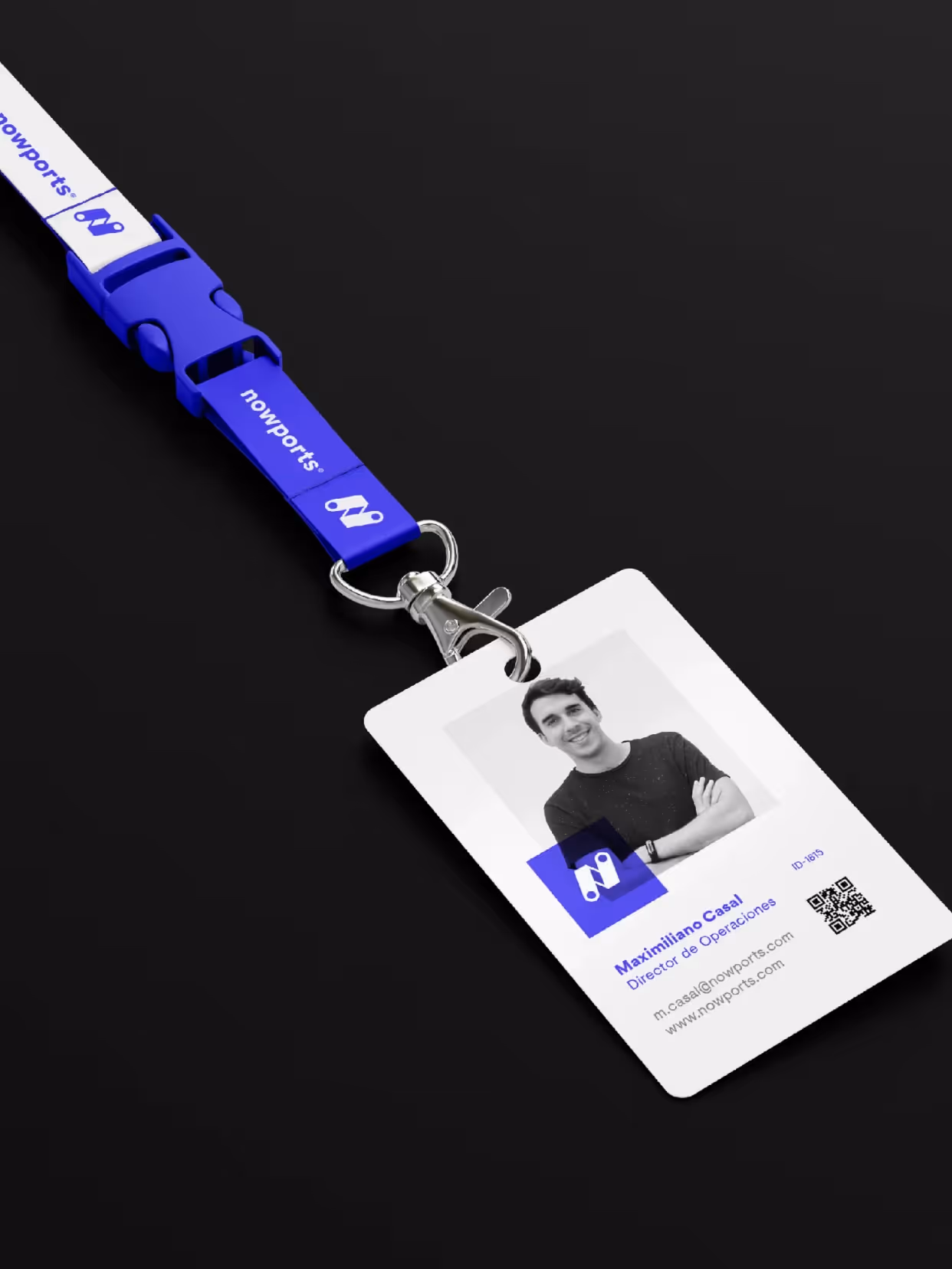
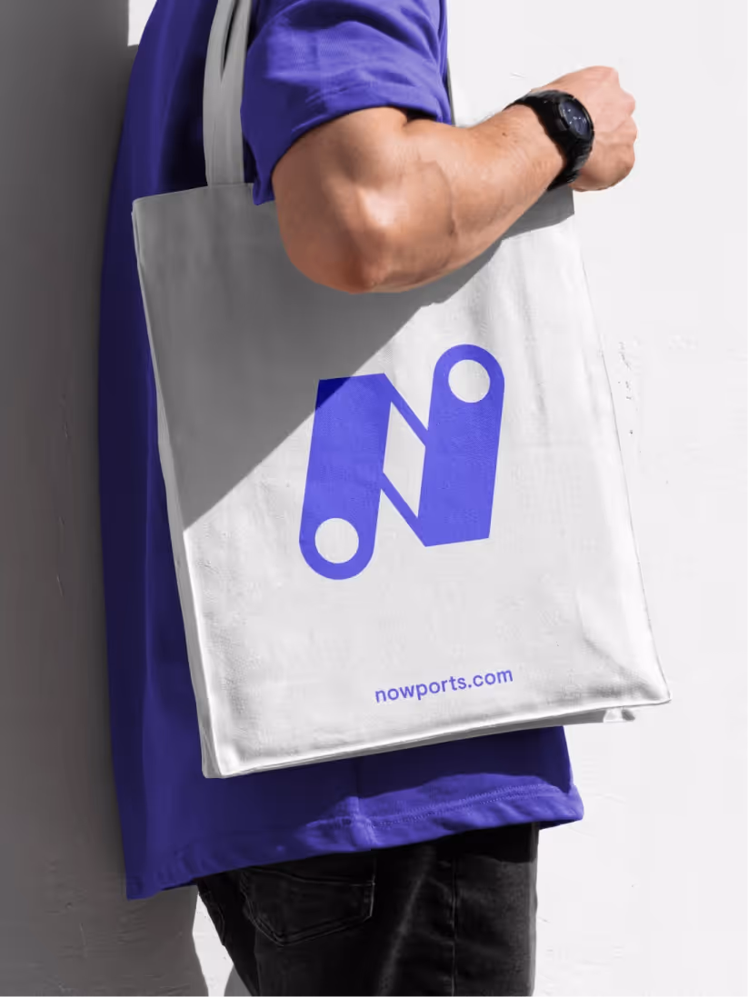
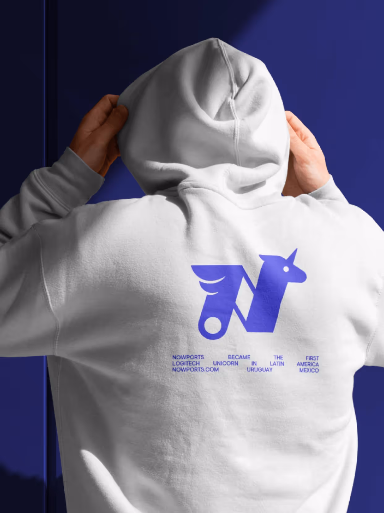
Built on the connection of points as the structural principle, this system relies on the "N", consolidated as symbol and orientation, a north that guides decisions and routes. A graphic language of nodes, lines, and pictograms makes the network Nowports articulates visible. The color palette expands the colors of Latin America. Illustrations represent territories, cultures, and flows.
Result
Nowports consolidates an identity that supports its expansion without losing continuity. A system that makes its value proposition visible and allows it to scale coherently, representing Latin America from a technological, diverse, and dynamic perspective.


Credits
Strategy
Beatriz Fernández Cordano, Gabriela Nisizaki,
Design
Michelle Malréchauffé, Beatriz Fernández Cordano, Gabriela Nisizaki
Motion
Matías Berta
Illustration
Michelle Malréchauffé, Matías Berta