Context
Cuentacuentos is Mosca's children's editorial line, part of a well-established brand in reading, stationery, and toys in Uruguay. The challenge was to create a sub-brand with its own identity while staying connected to the parent brand. A visual universe children could recognize as their own.
Strategy
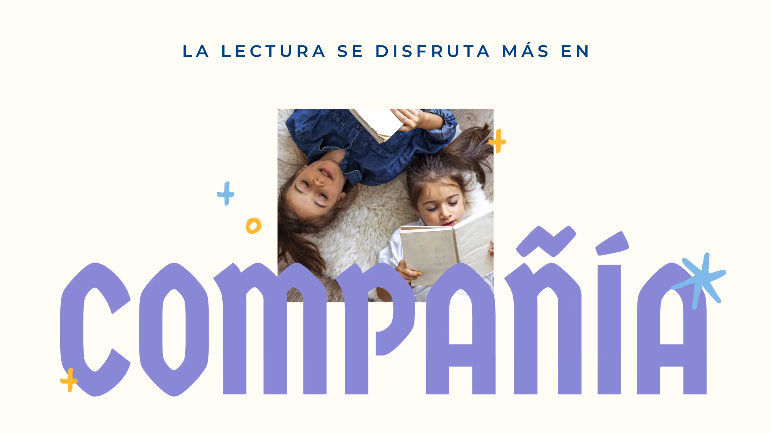
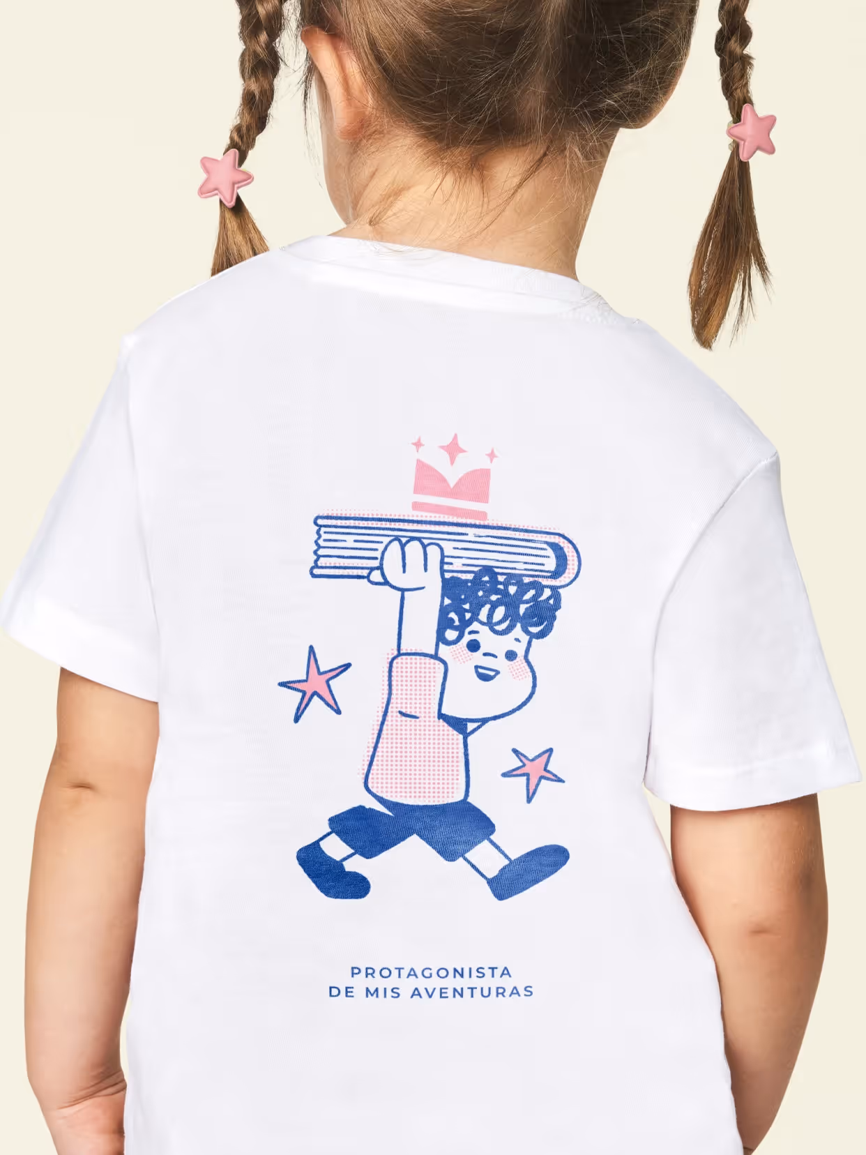
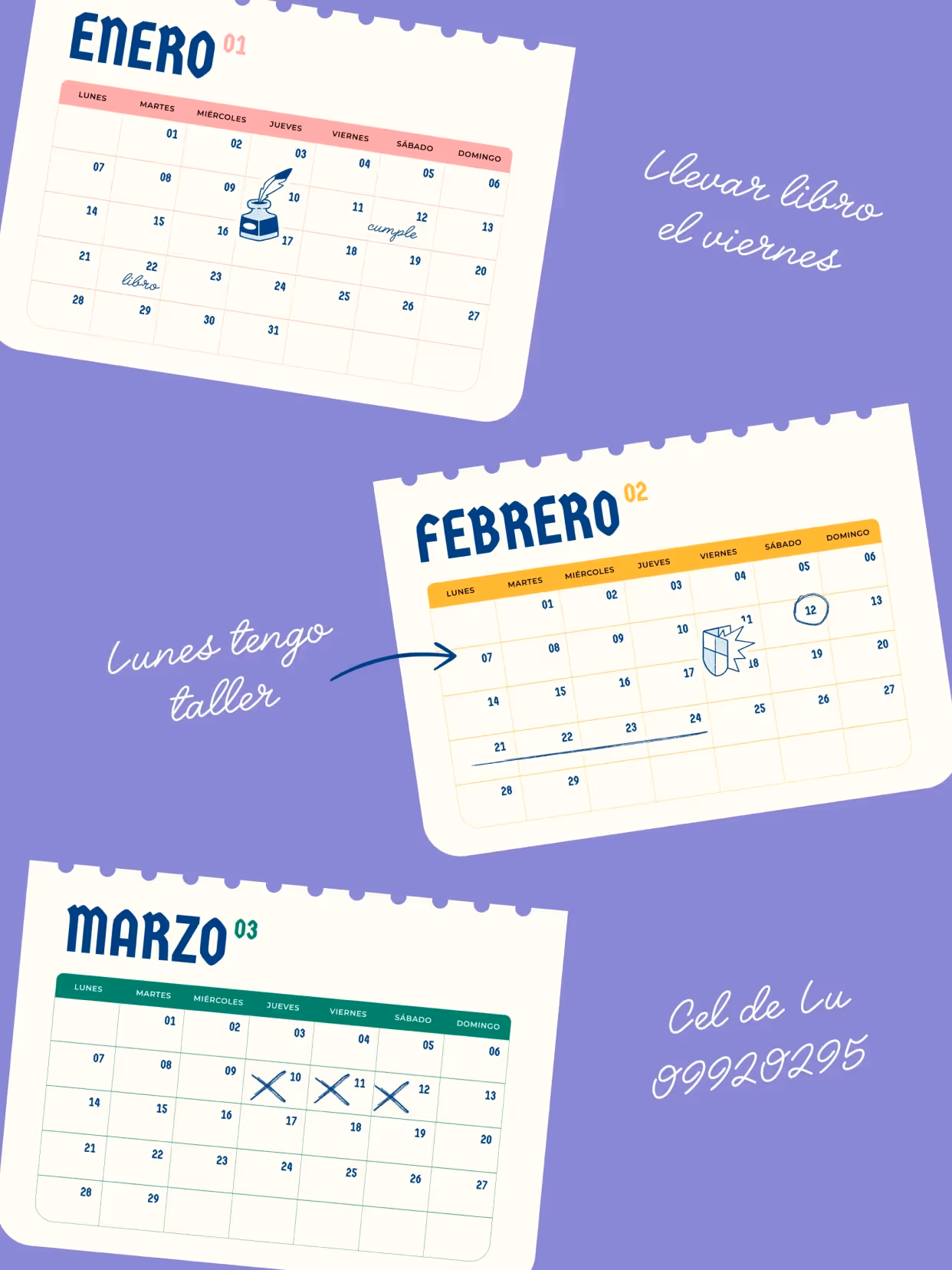
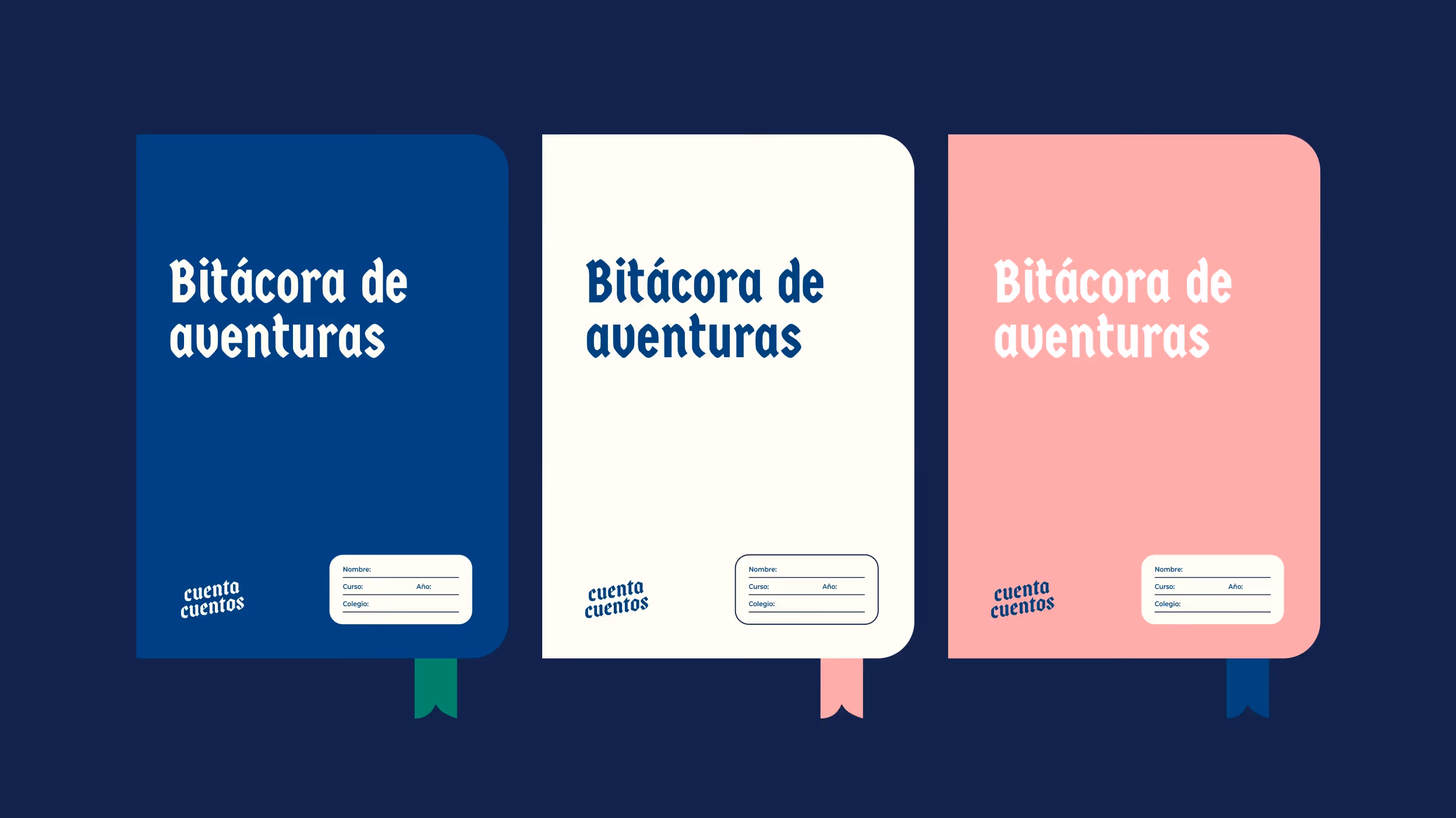
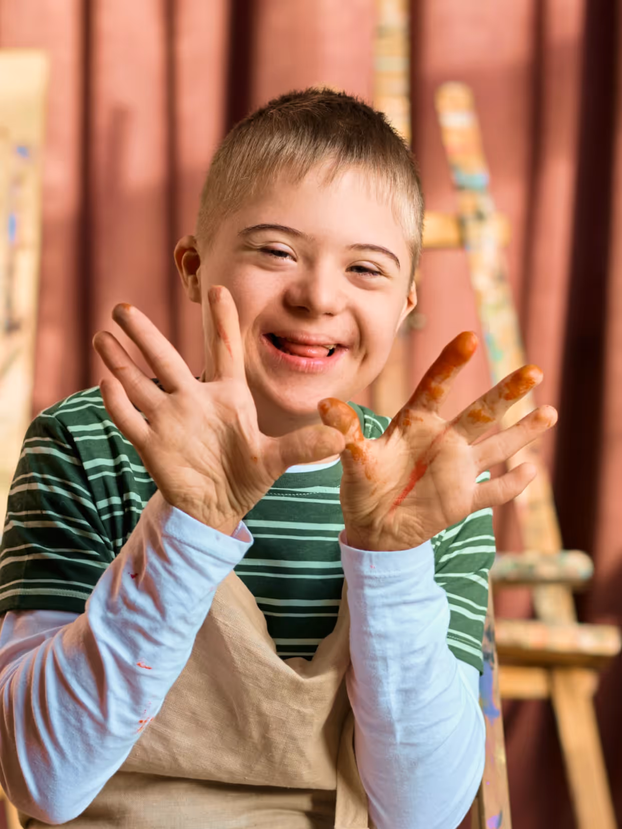
We defined Cuentacuentos as a space that supports publications, workshops, and events, rather than a simple book collection. This required a system that is flexible, recognizable, and easy to apply across all formats. The positioning places the child at the center of the experience. Reading becomes a personal and active space, where each child is the protagonist of their own story.
Implementation
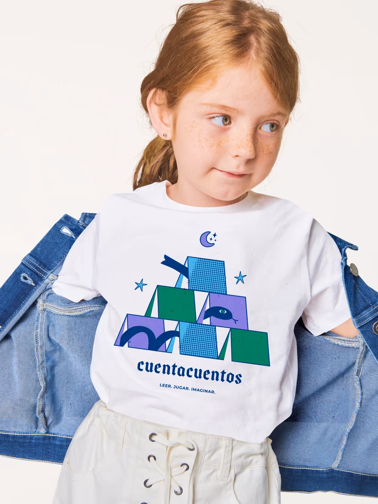
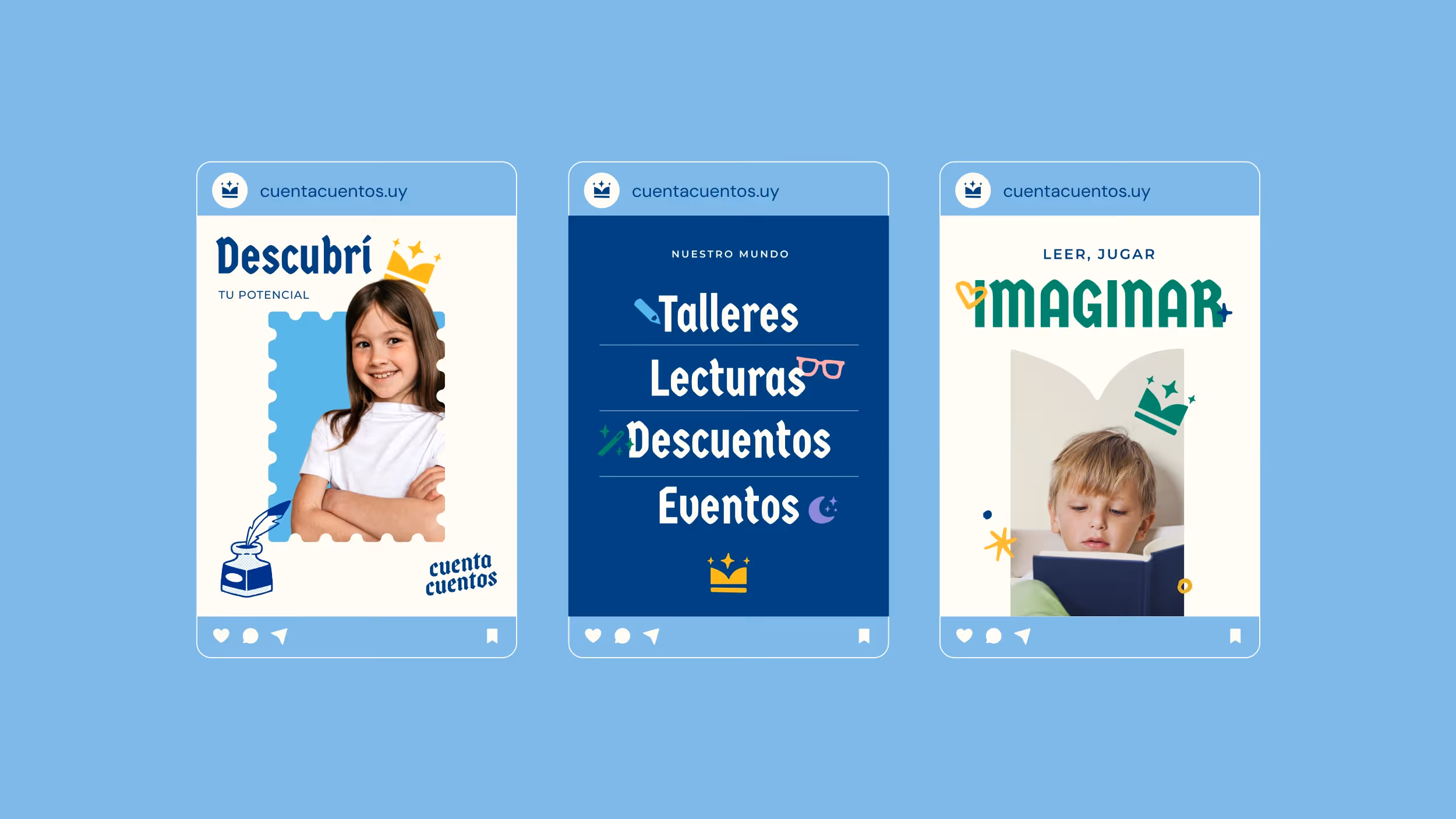
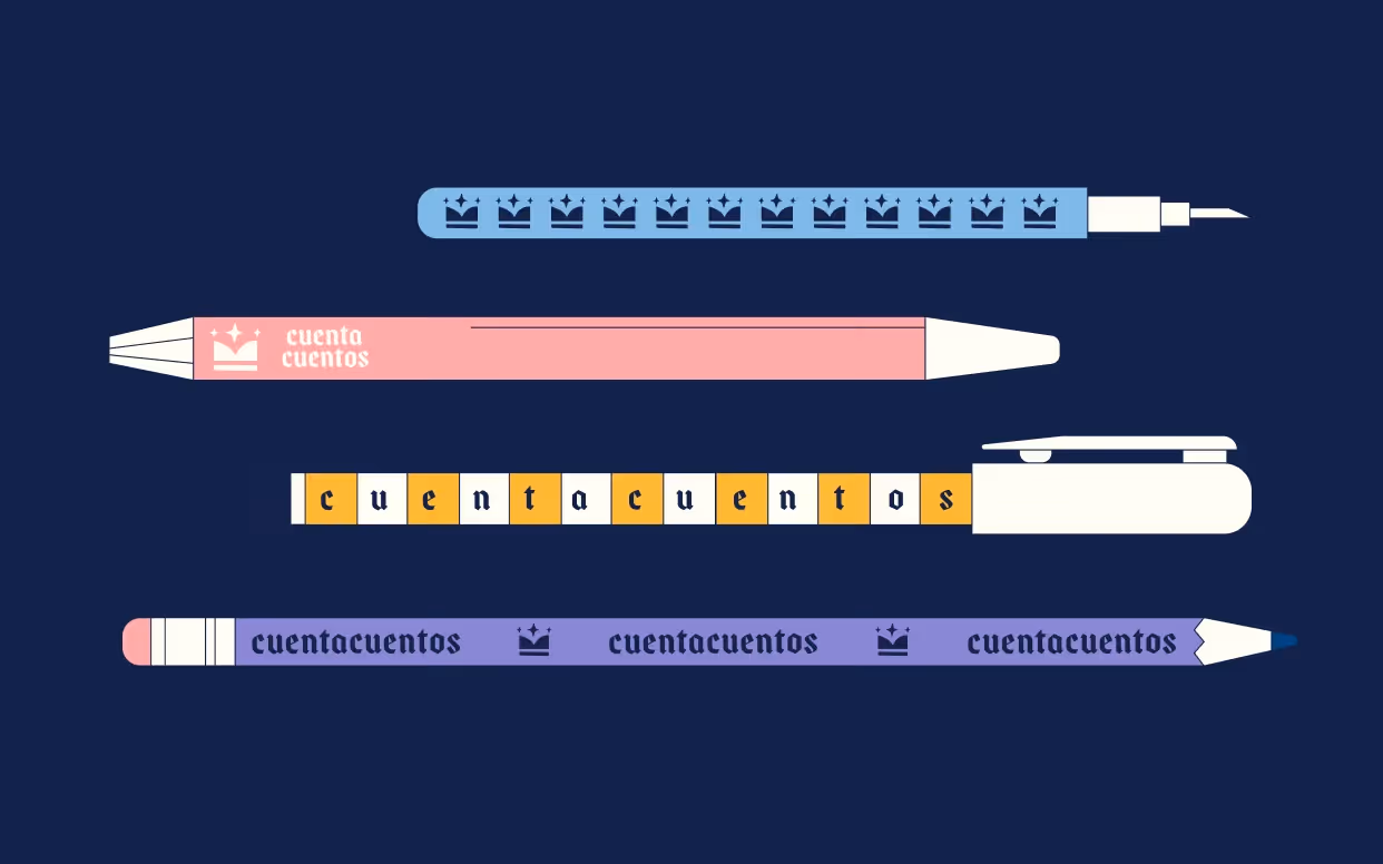
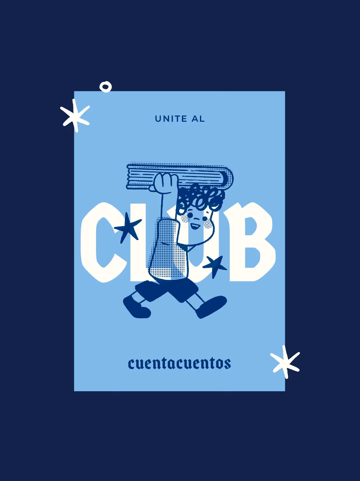
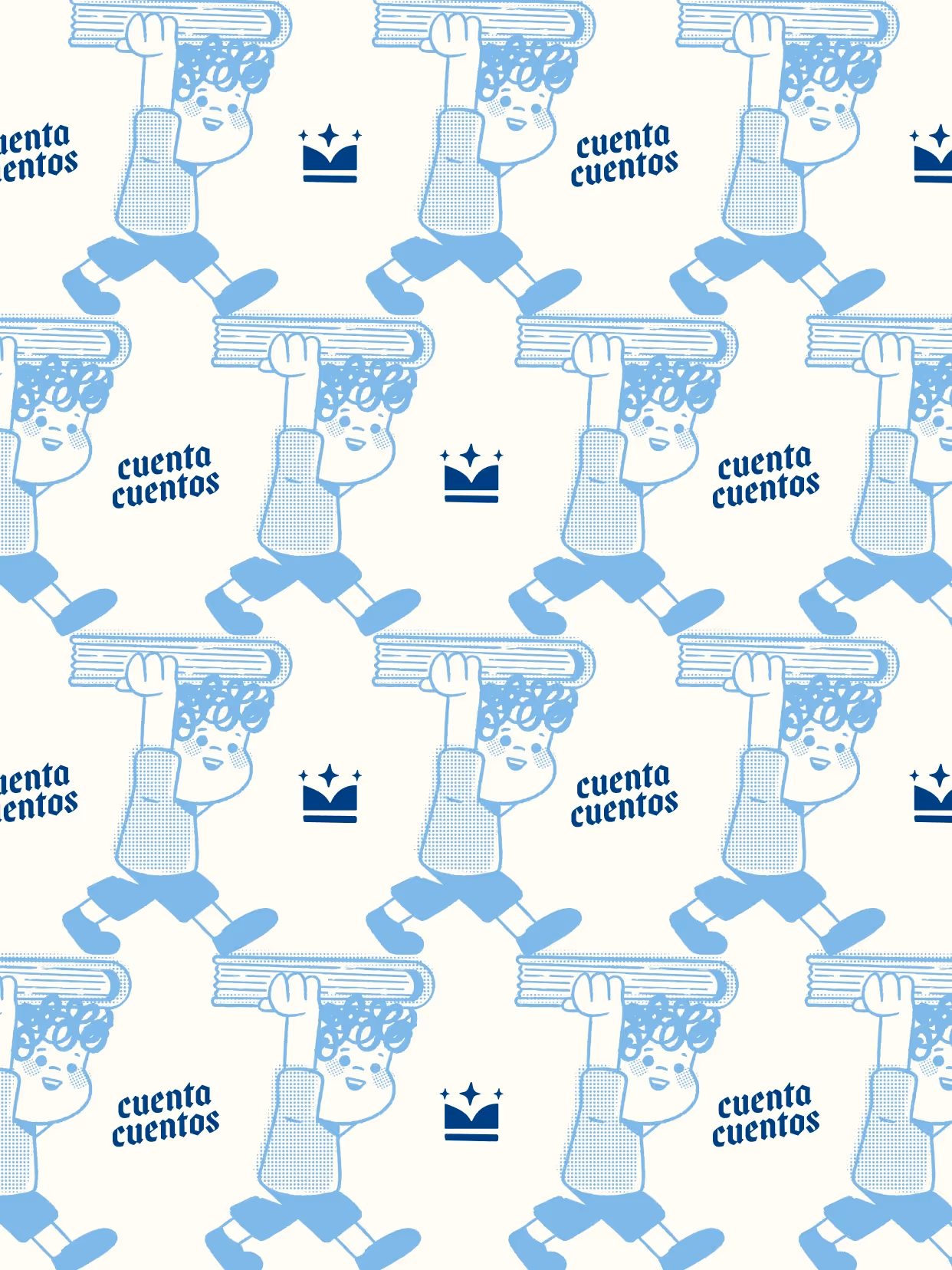
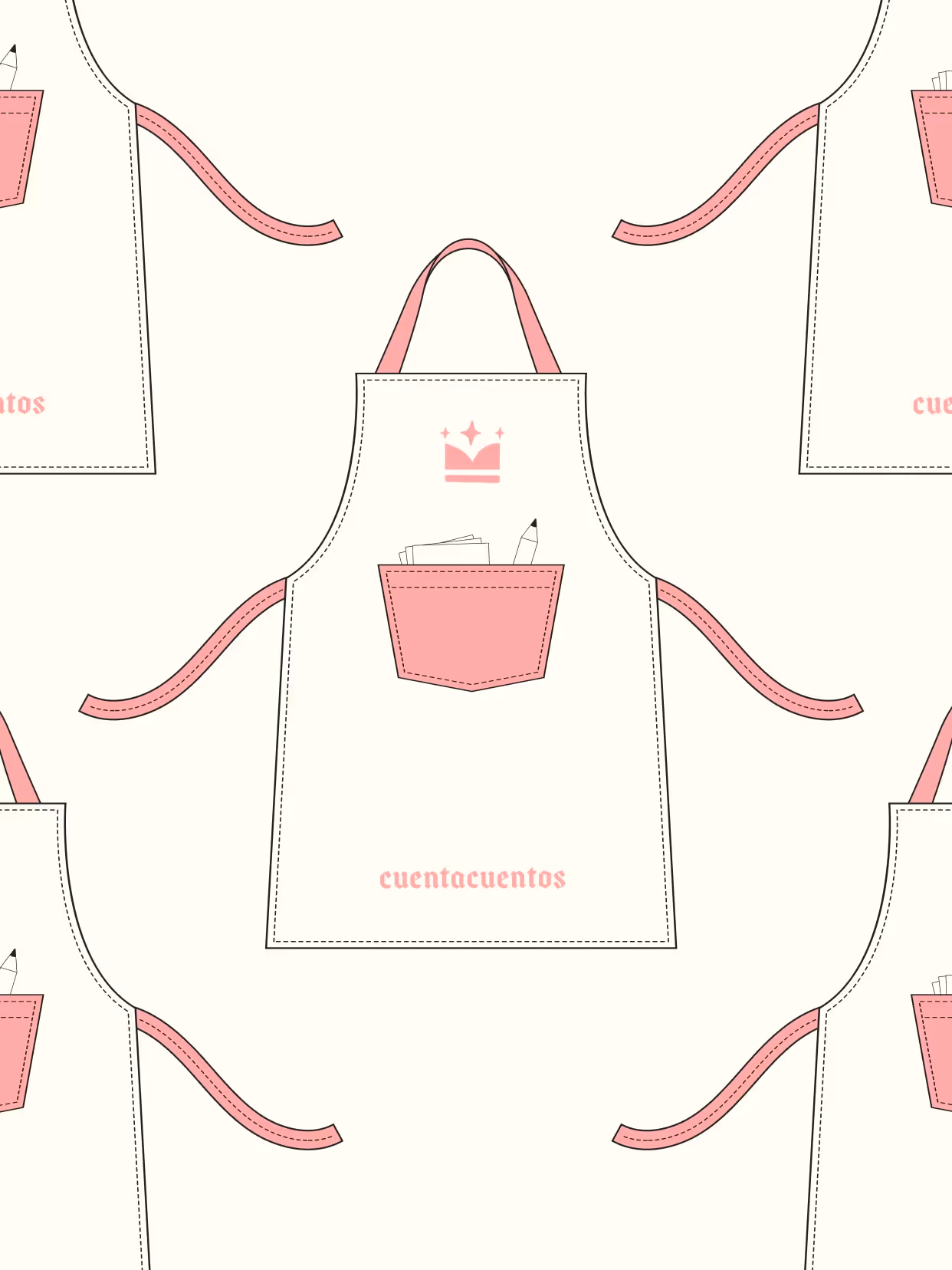
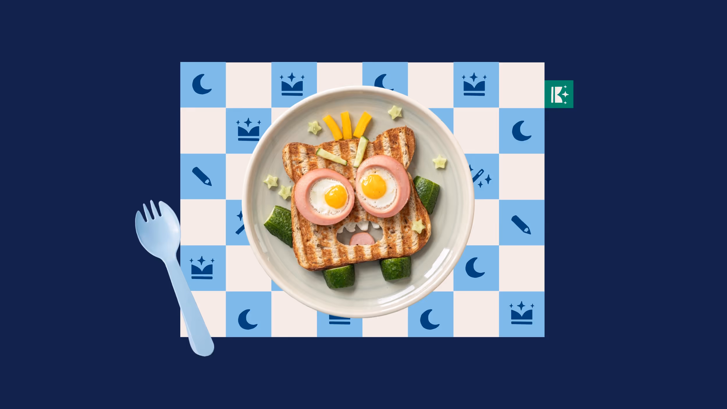
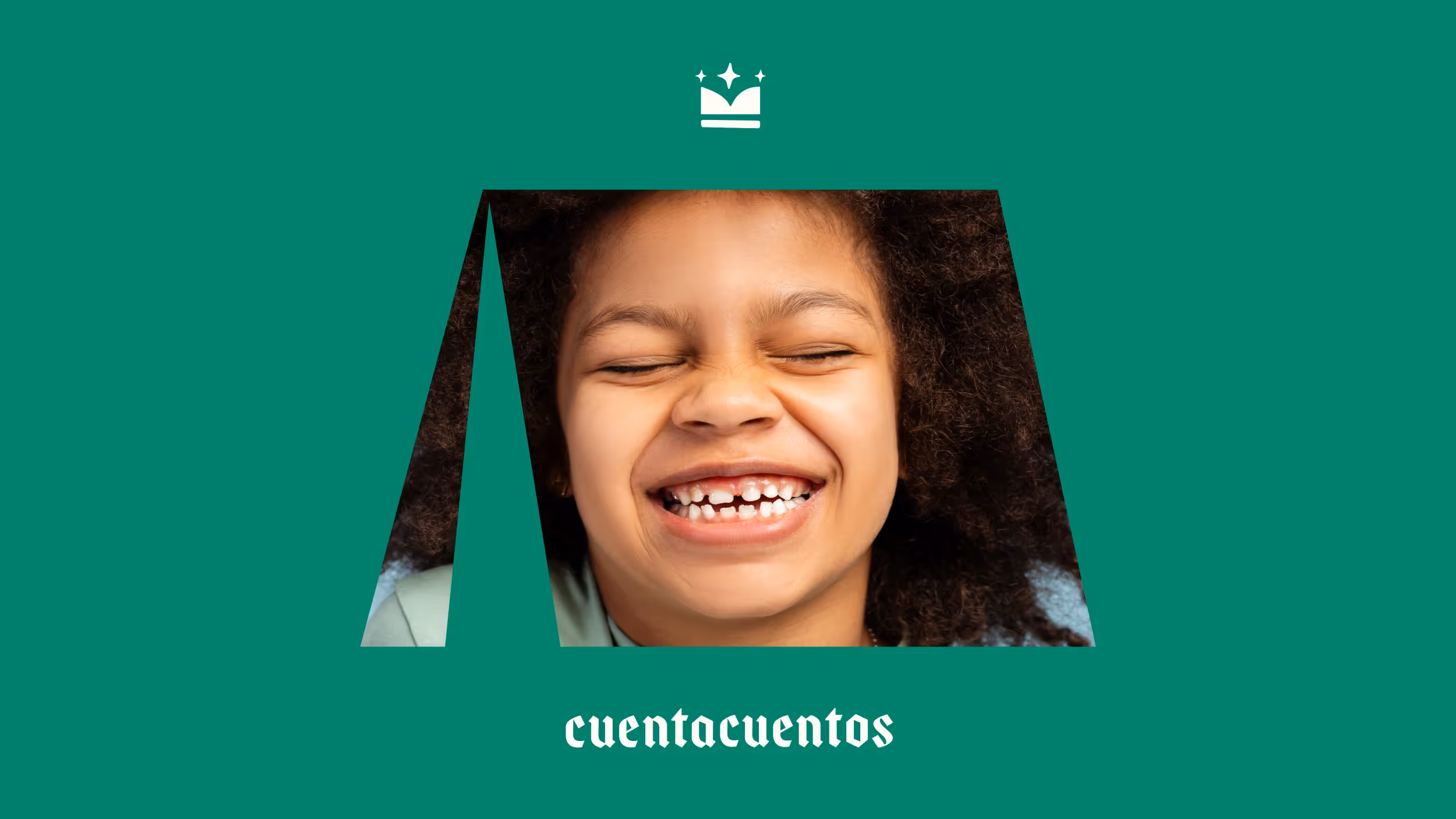
The visual system builds a playful universe with references to medieval imagery. The logotype combines a gothic typeface with a symbol that functions as both crown and open book: every child as protagonist of their own story. A broad, vibrant color palette maintains connection to the parent brand. Illustrations, icons, and a central character enable scenes, patterns, and applications across diverse formats.
Result
Cuentacuentos evolves from an editorial line into a cohesive system. A close and familiar identity, with a sense of adventure and rooted in the nostalgia of growing up with books. A distinct universe that supports and shapes early relationships with reading.
Credits
Design
Amparo Bengochea da Fonte, Romina Justet, Lucía Fuentes, Sofía Lasida, Matías Berta