Context
Ananá is a digital design and product studio that, after nearly 10 years of evolution, needed the visual aspect to catch up with its trajectory: from generalist to focused, from intuitive making to clear processes, from graphic design to product design, strategy, and development.
Strategy
We explored how a brand can remain accessible while projecting experience and depth. We sought to build a system that maintains a balance between expertise and freshness.
Implementation
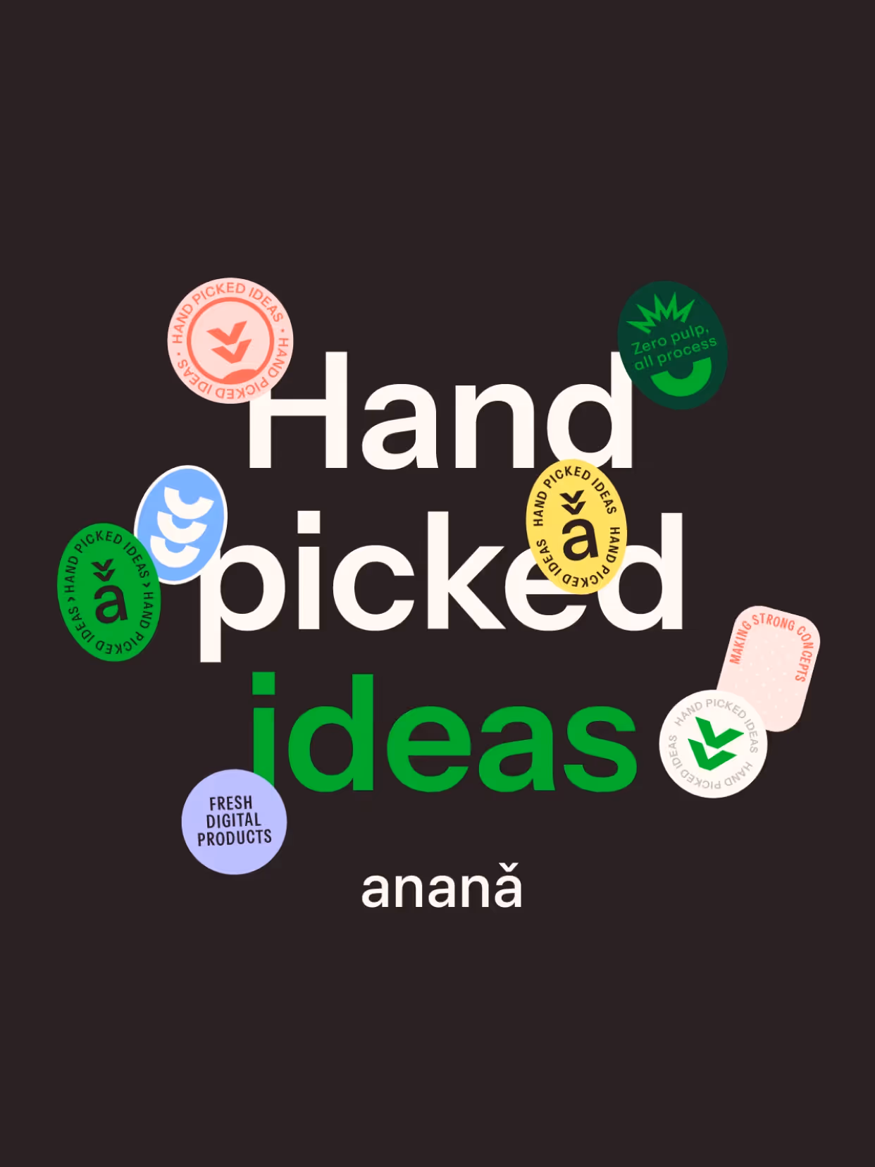
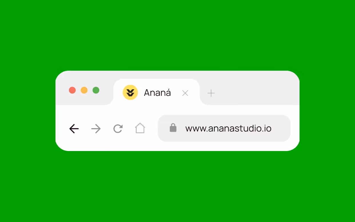
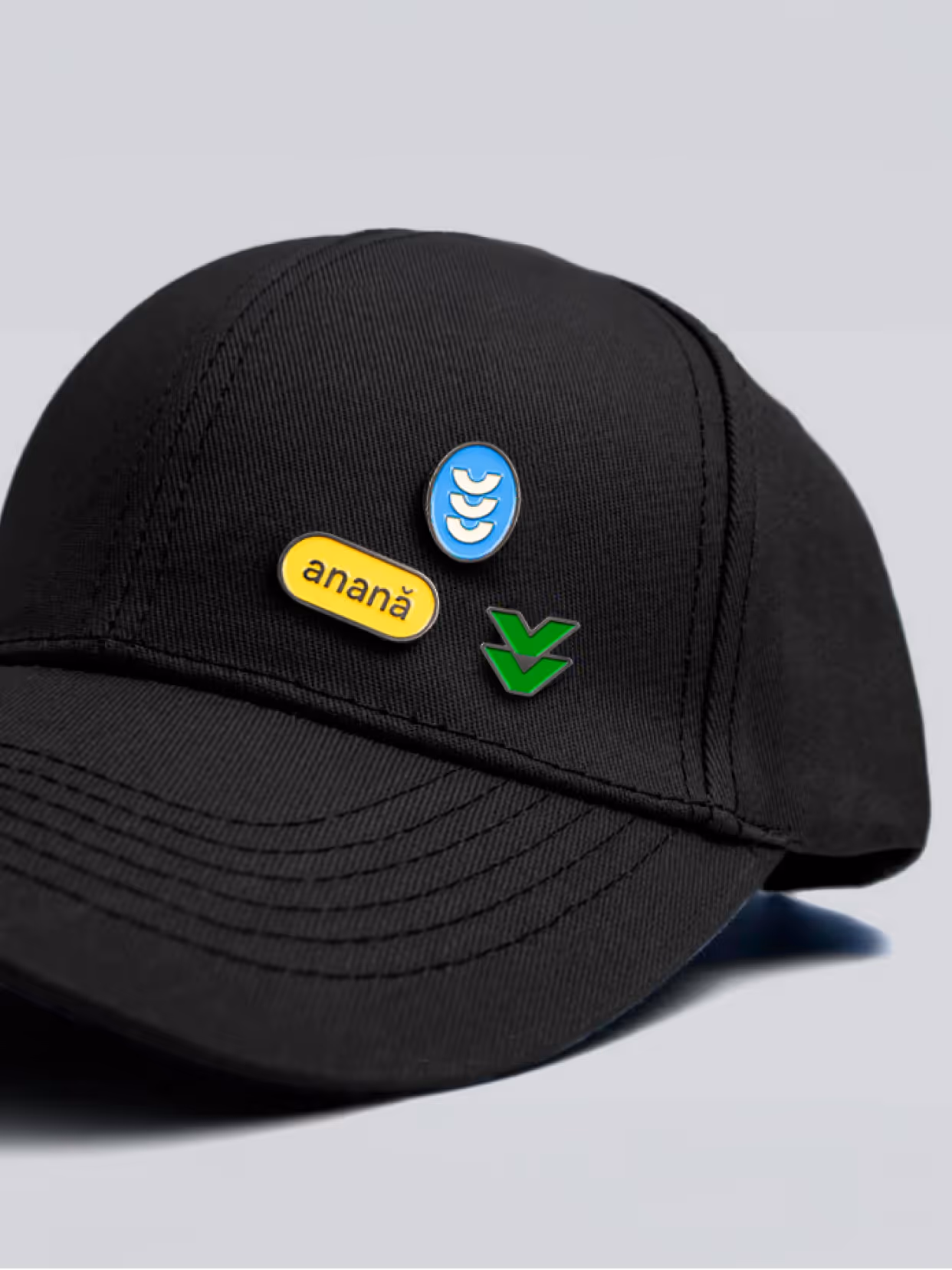
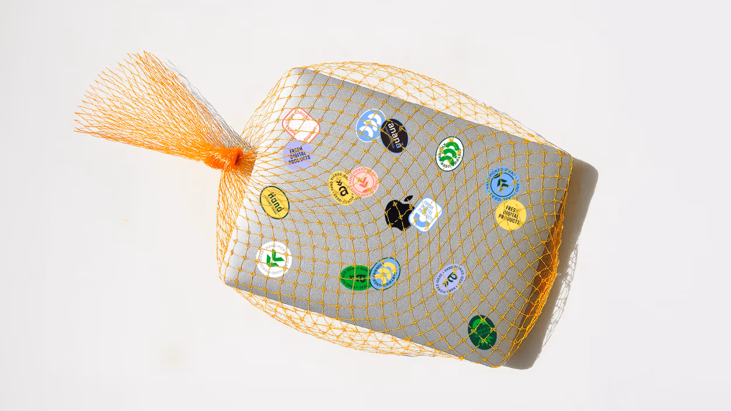
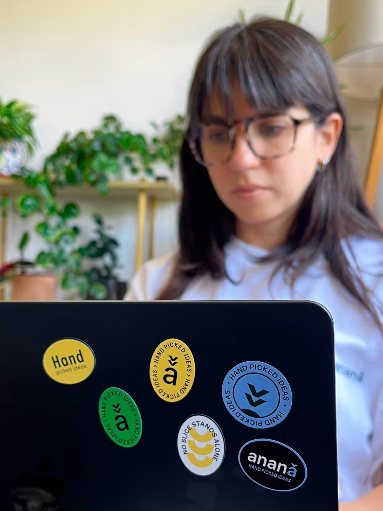
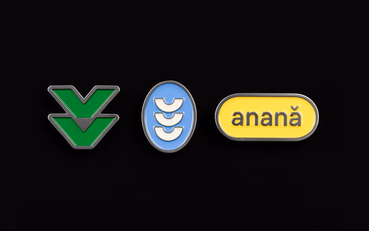
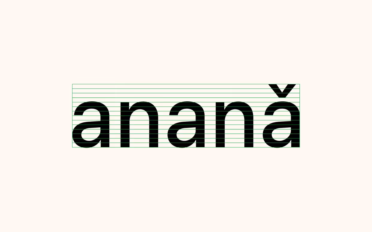
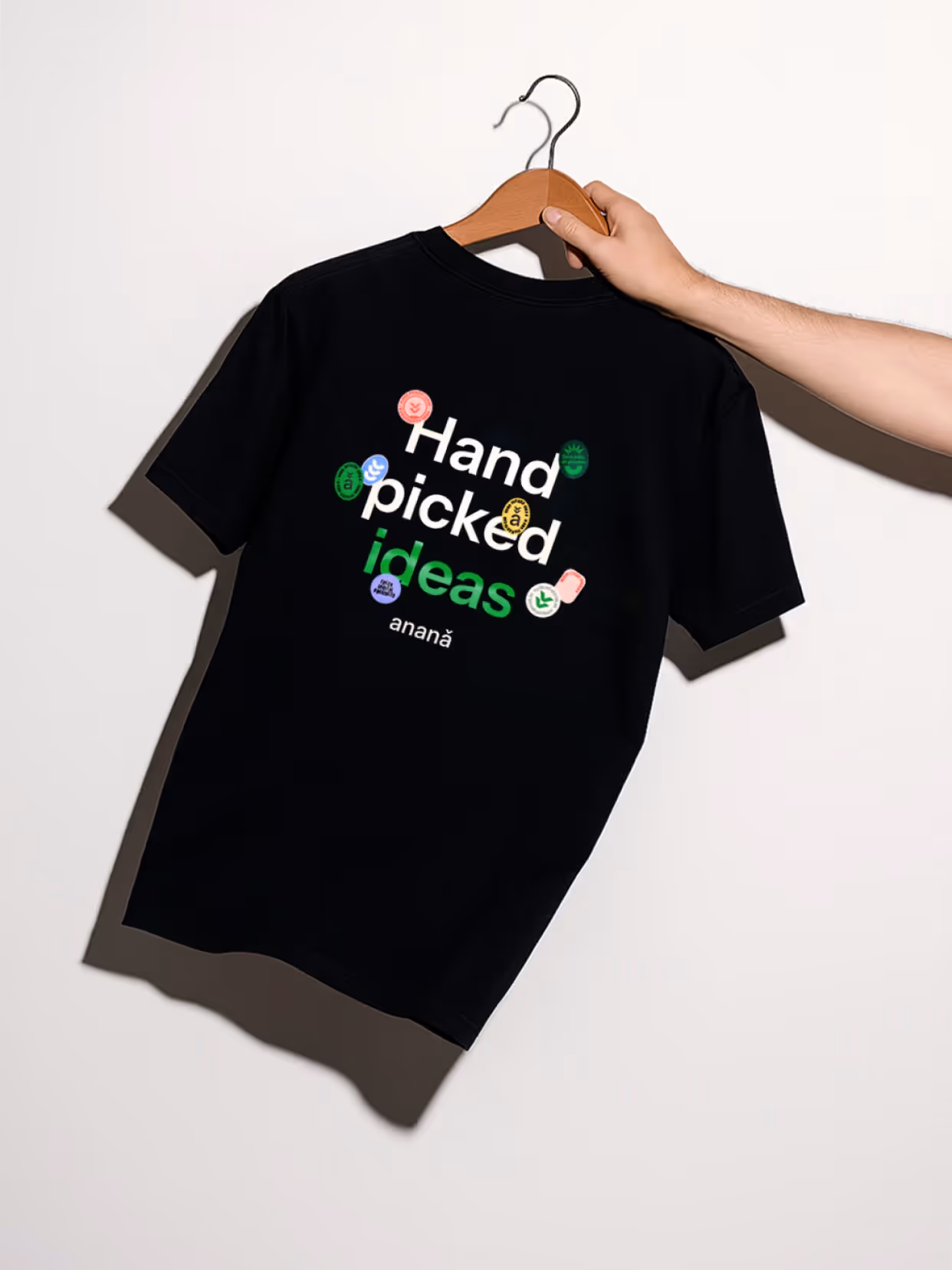
We took the pineapple as our conceptual starting point. From its structure, we developed grid-like patterns for the interface, presentations, and digital content, while various elements of the fruit, such as segments, cuts, and textures, appear as interventions throughout the system. These subtle touches coexist with a typographic base that combines sans-serif and serif fonts, and a flexible palette that maintains freshness without sacrificing consistency.
Result
An identity that accompanies the evolution of the studio and organizes its proposal, integrating a unique language that is recognizable in every application. An expressive, technical, and adaptable system.

Credits
Design
Matías Berta, Sofía Lasida