Context
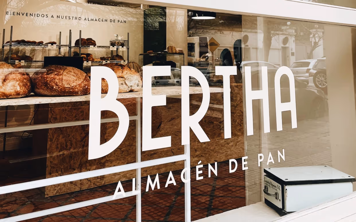
Bertha is a bakery created by two entrepreneurs, born from the need to highlight the role of women in this industry. The brand identity had to reflect this vision, honoring the baking tradition from a modern perspective.
Strategy
We approached the brand at the intersection of tradition and innovation. We defined a narrative centered on female strength, building an identity that represents both the craft and the women who practice it. The proposal aimed to foster a sense of connection and belonging, appealing to a broader community.
Implementation
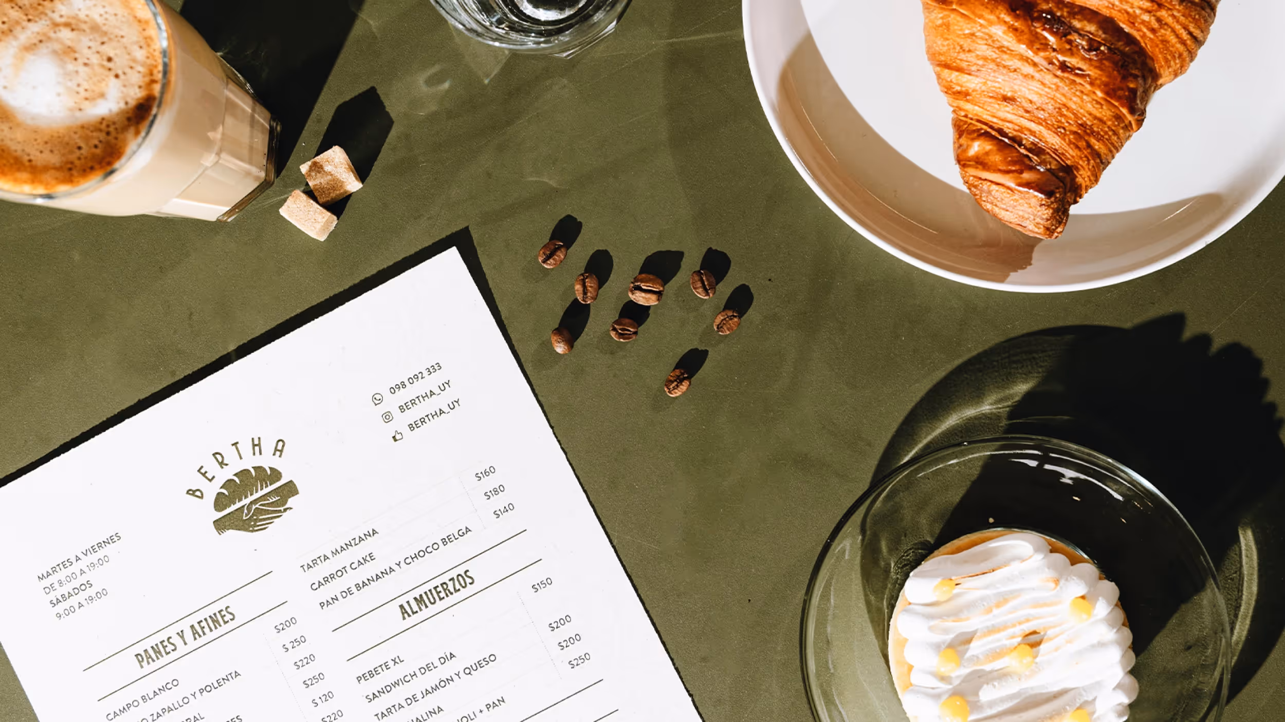
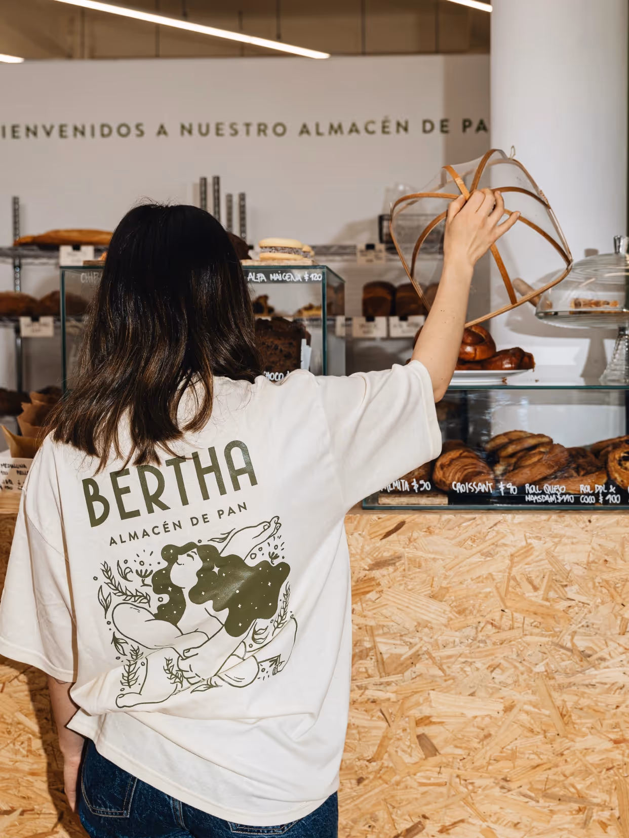
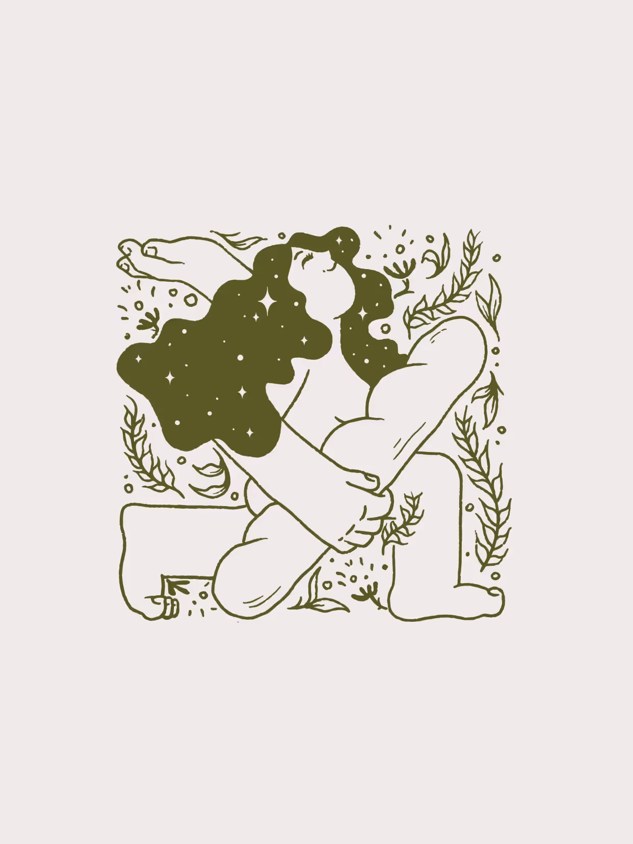
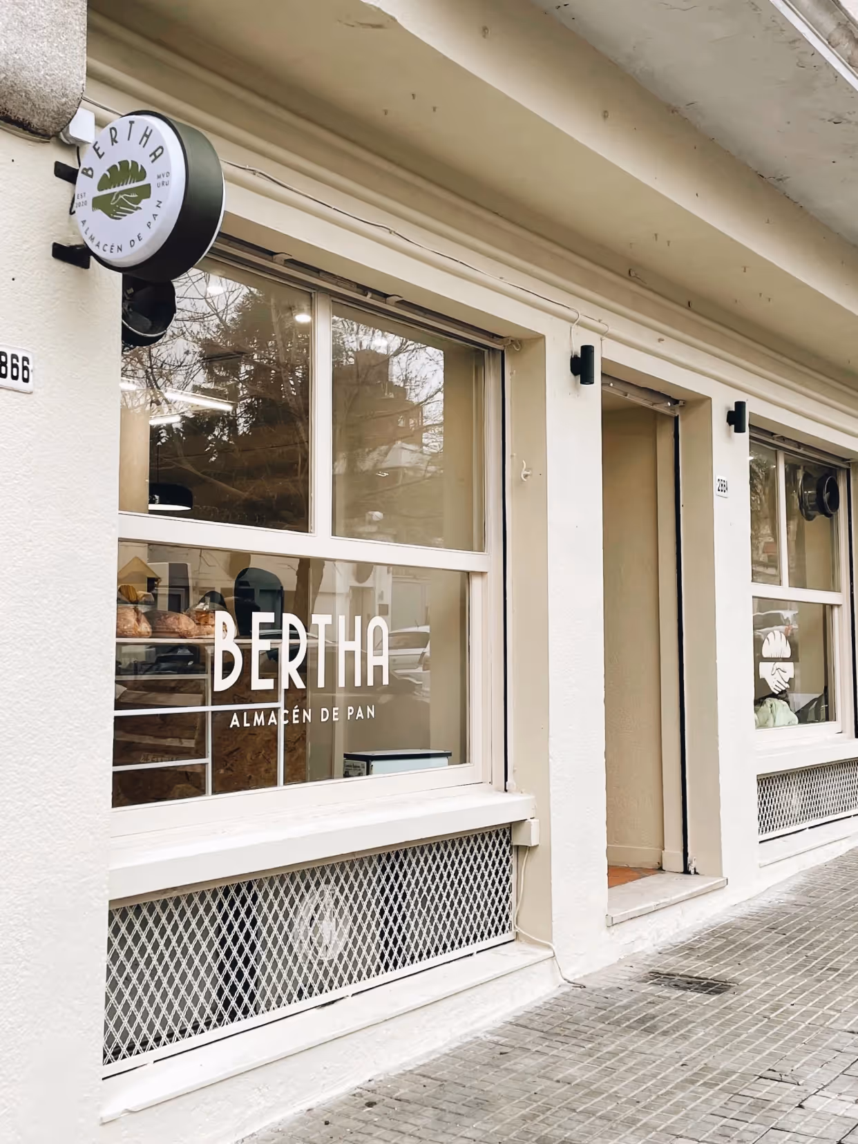
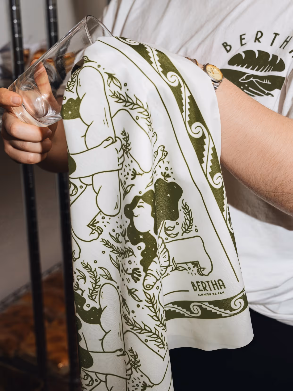
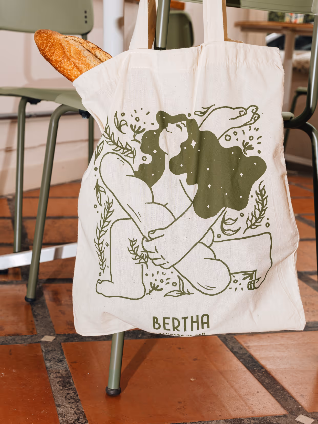
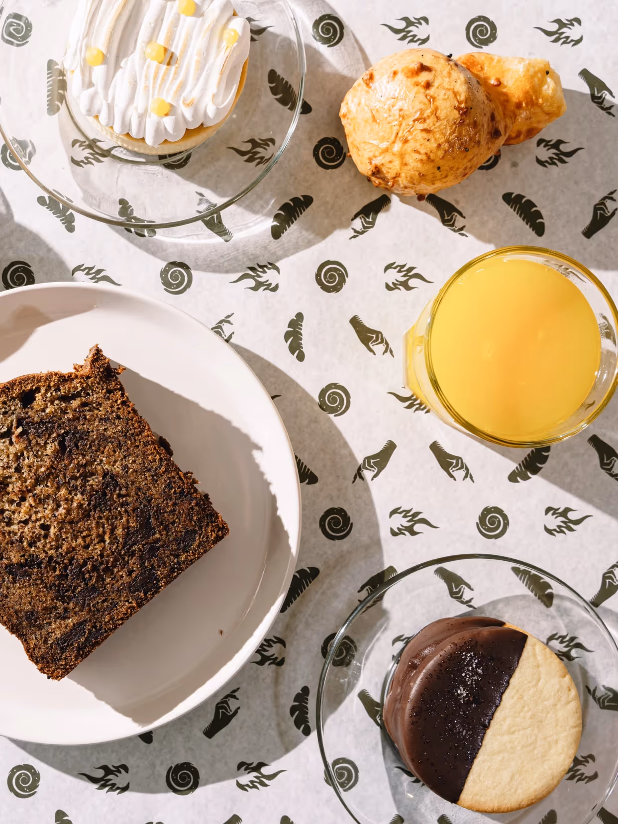
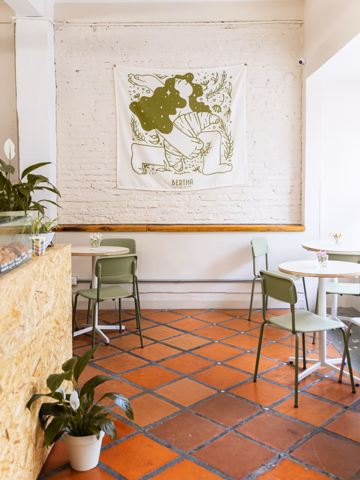
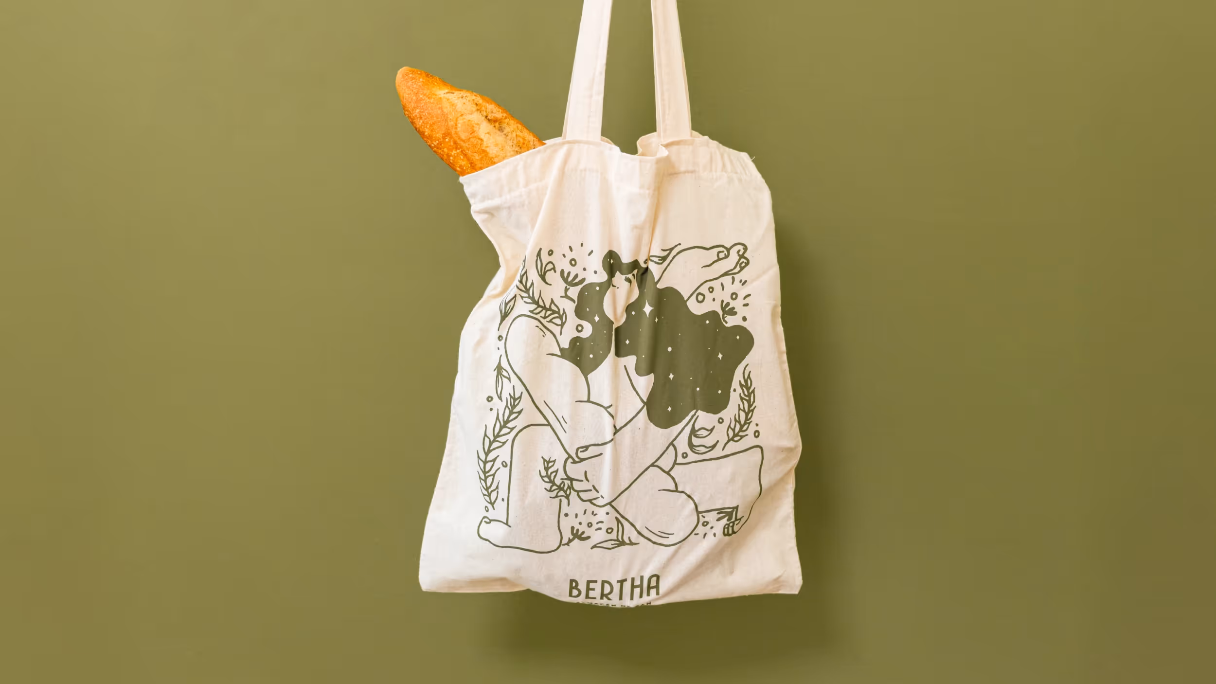
We developed a visual identity celebrating female strength, with elements that honor women's achievements through a contemporary and inclusive aesthetic. The Bread Woman became Bertha's central symbol, representing artisanal baking tradition and the women who sustain it. Designed to be accessible and modern, allowing customers to identify with the brand's values. Color and typography were chosen to convey closeness and community.
Result
Bertha celebrates female strength with a modern and inclusive identity. Bertha's design highlights personal and emotional connections, building a brand that reinterprets tradition and represents and inspires women entrepreneurs.


Credits
Design
Gabriela Nisizaki, Matías Berta