Context
Colperf has been building metal solutions for over 15 years. A solid track record, precise technique, and a craft that few master at this level. The challenge was to build an identity that clearly expressed the precision, discernment, and complexity of their work and could be sustained across all levels of application.
Strategy
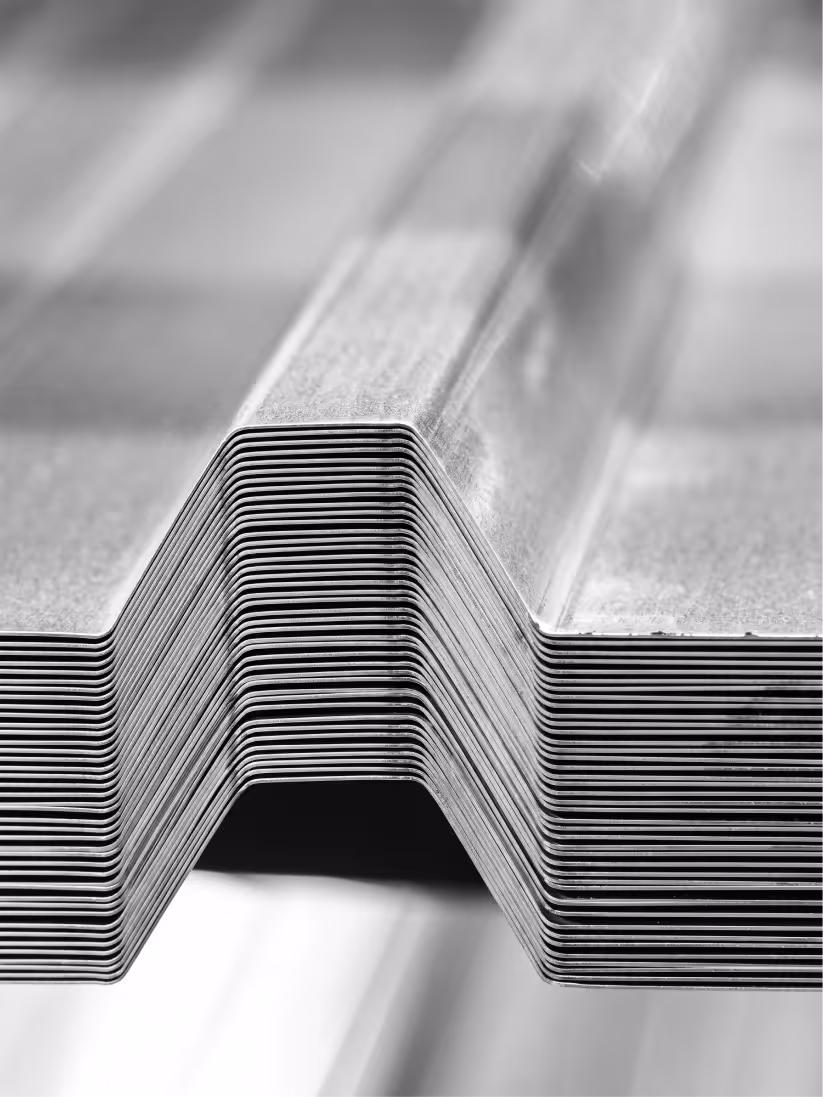
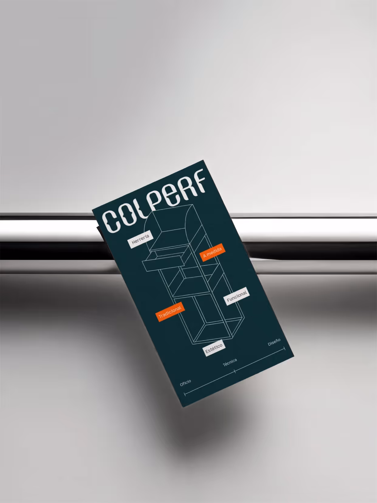
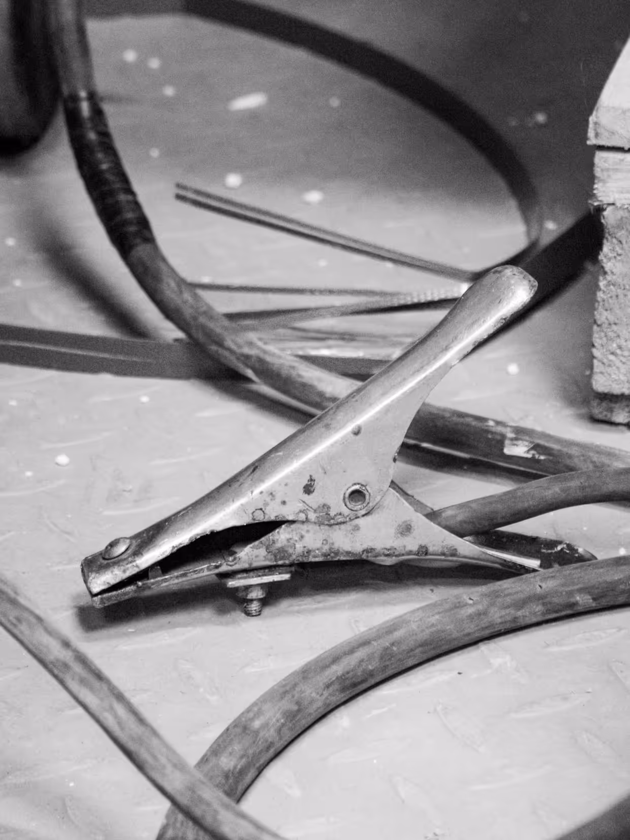
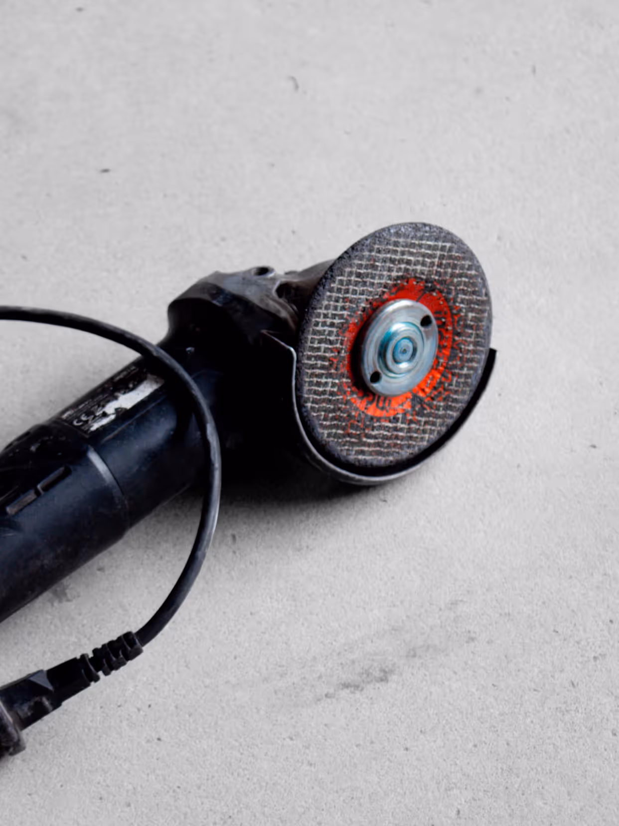
We started with the history of the craft as a structural foundation. The system had to reflect the way Colperf works with the material: precision, assembly, and decisiveness in every cut. We defined a direction that combines technical language with a workshop feel, communicating professionalism without coldness or nostalgia.
Implementation
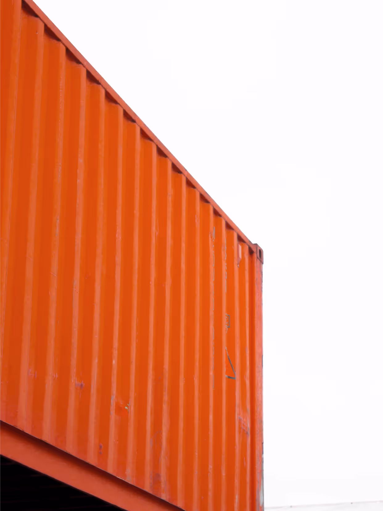
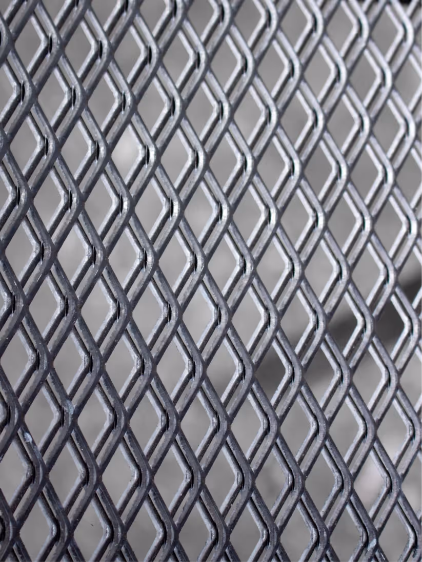
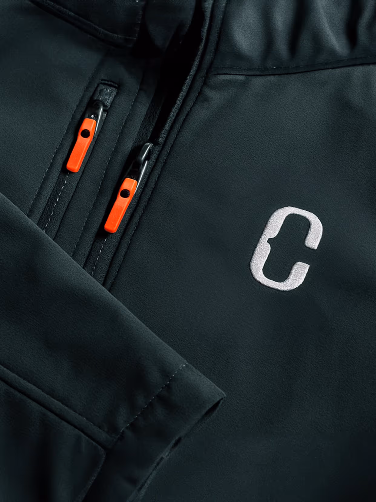
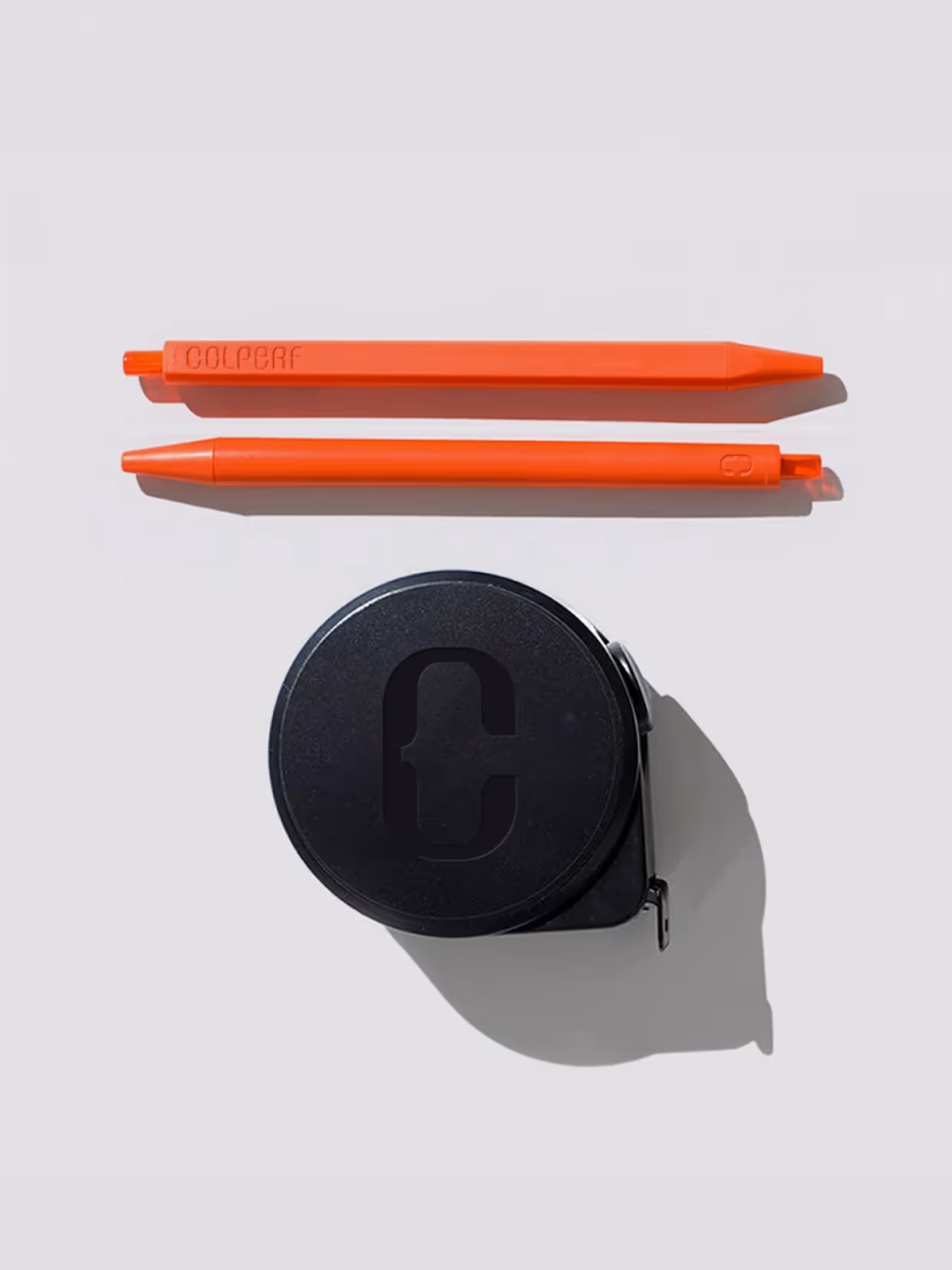
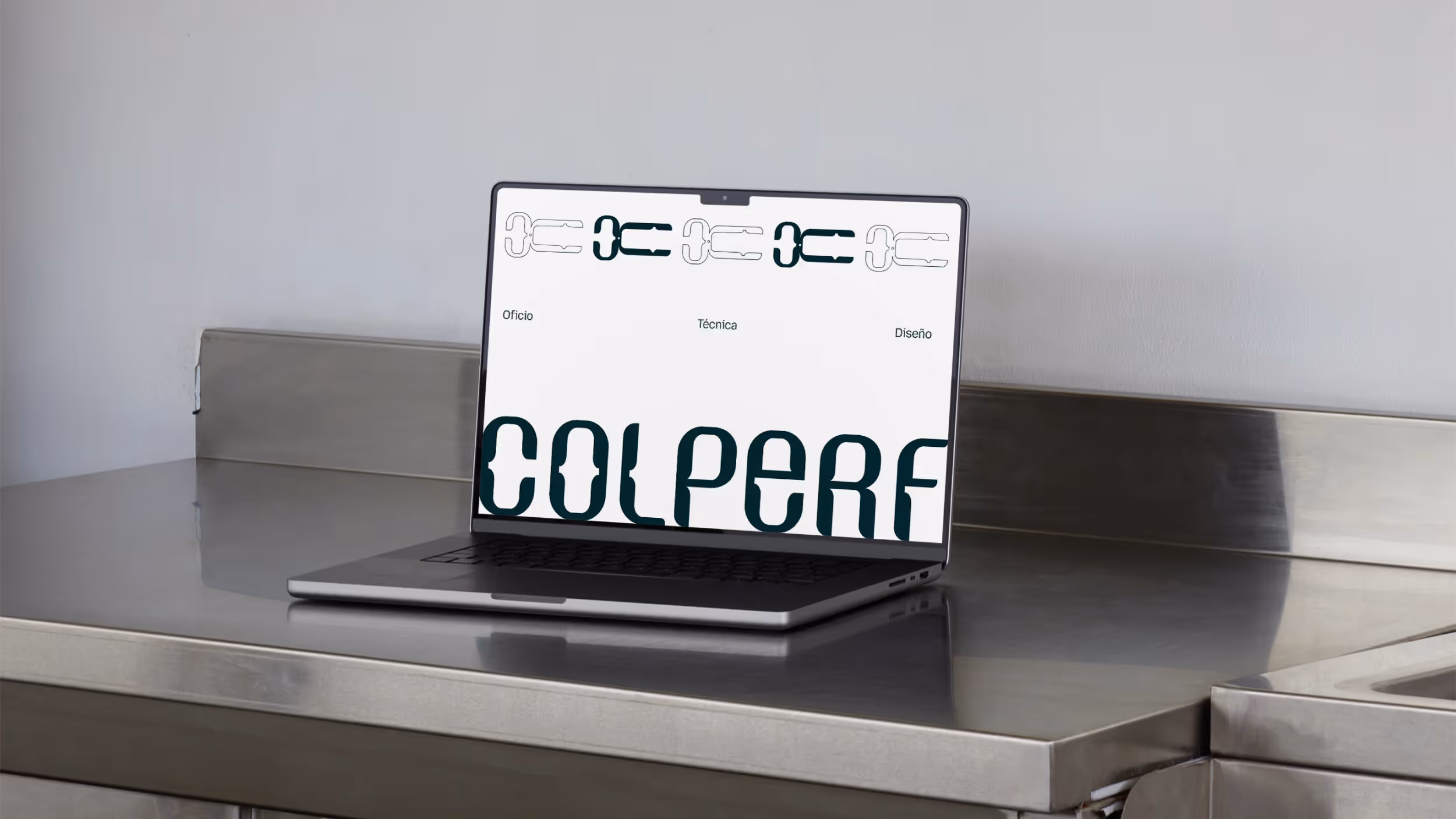
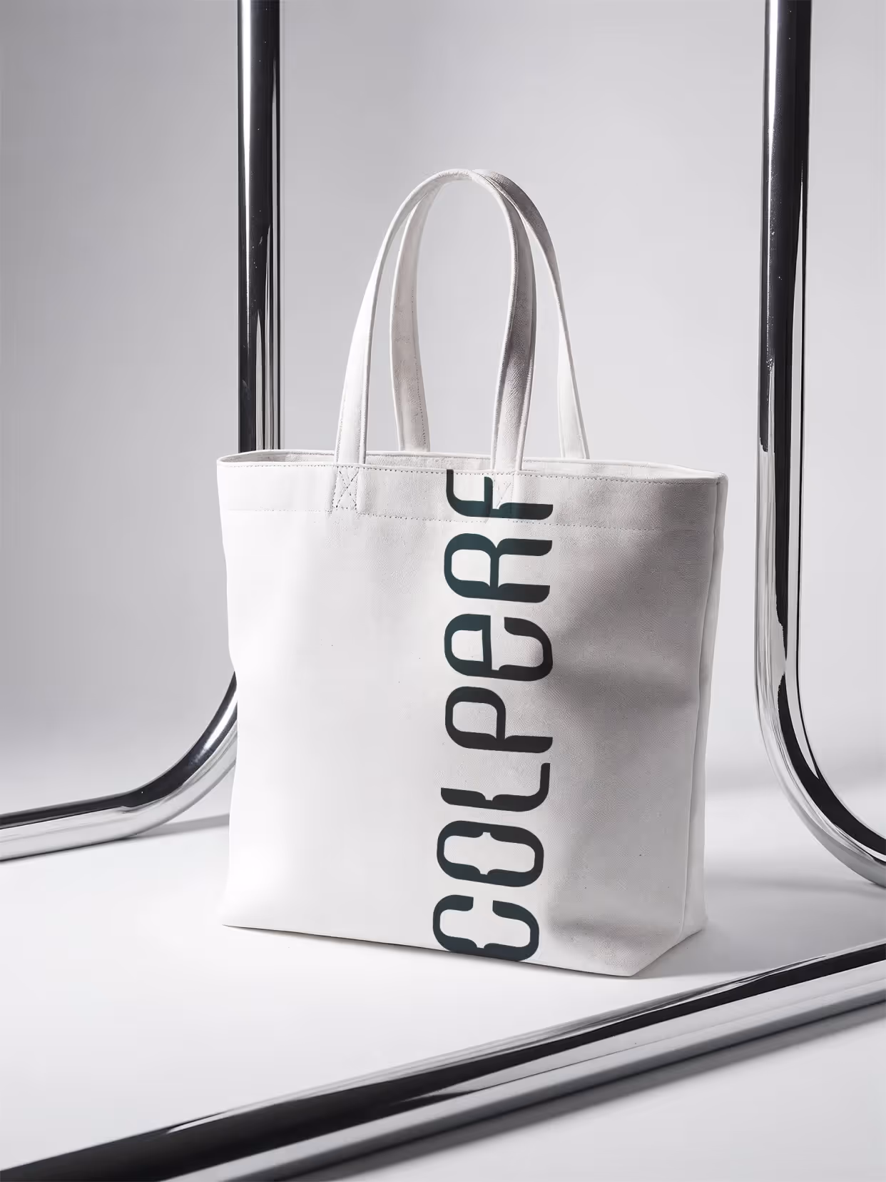
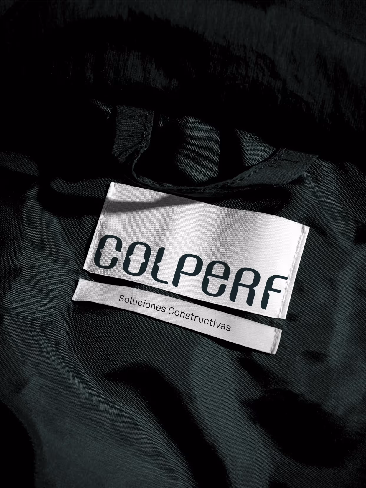
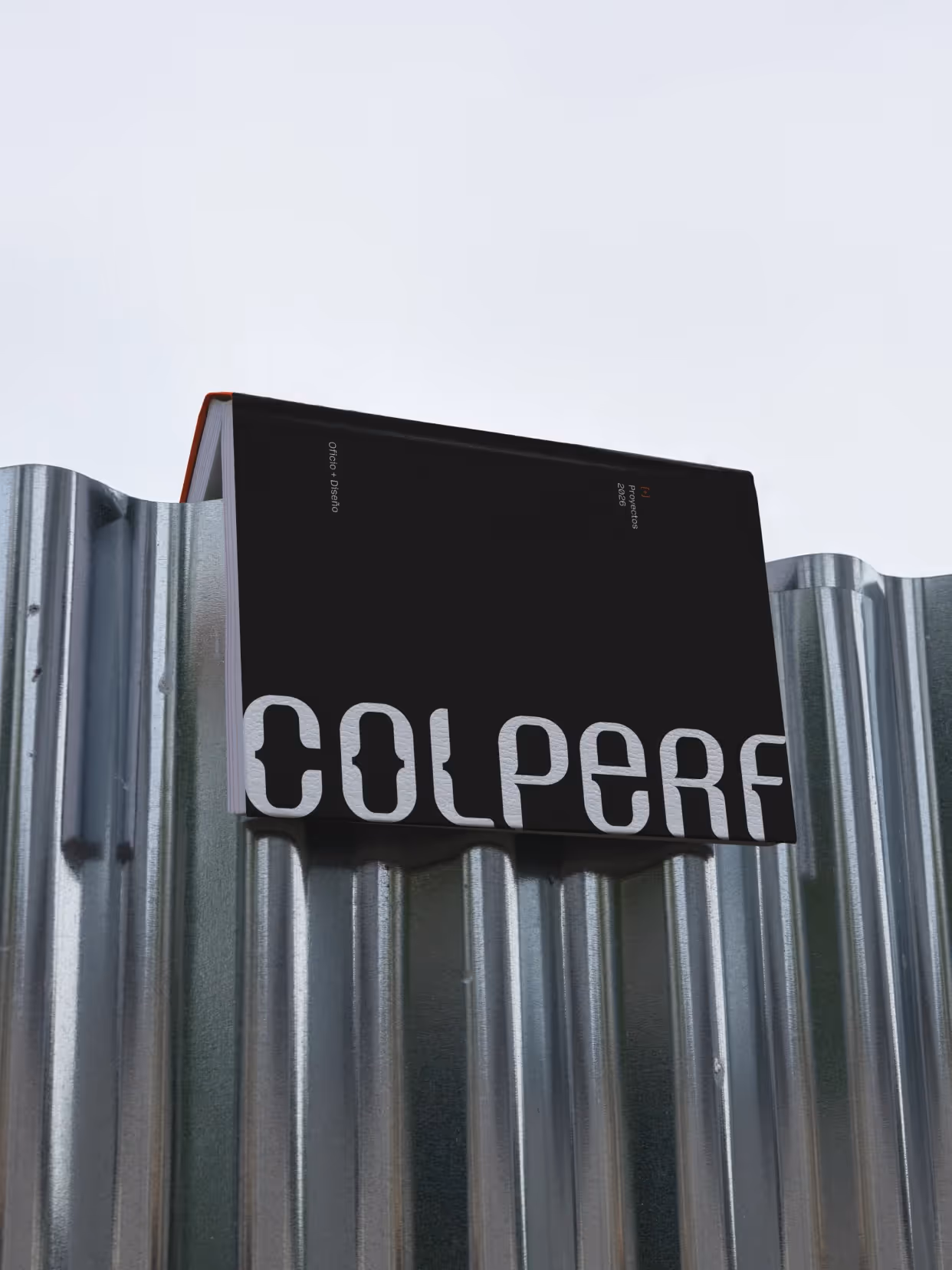
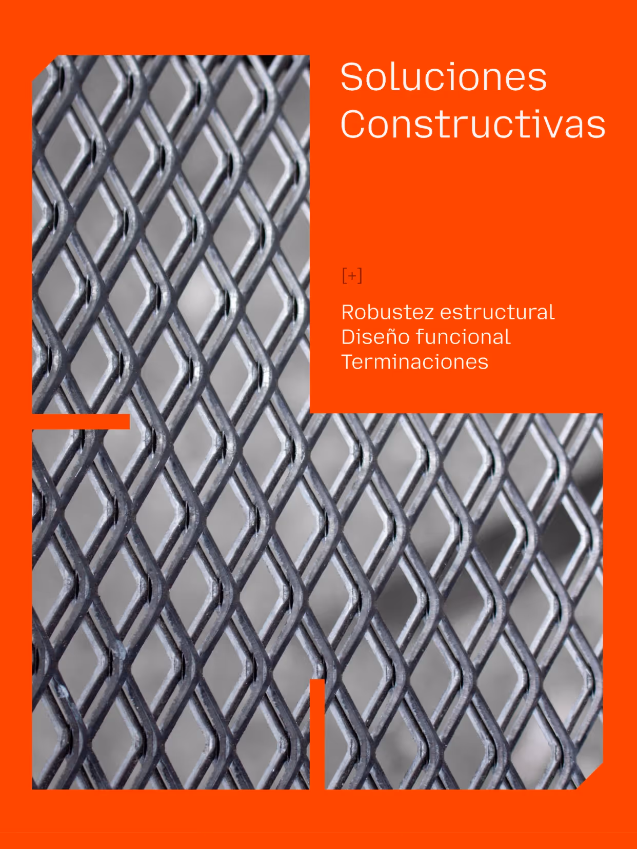
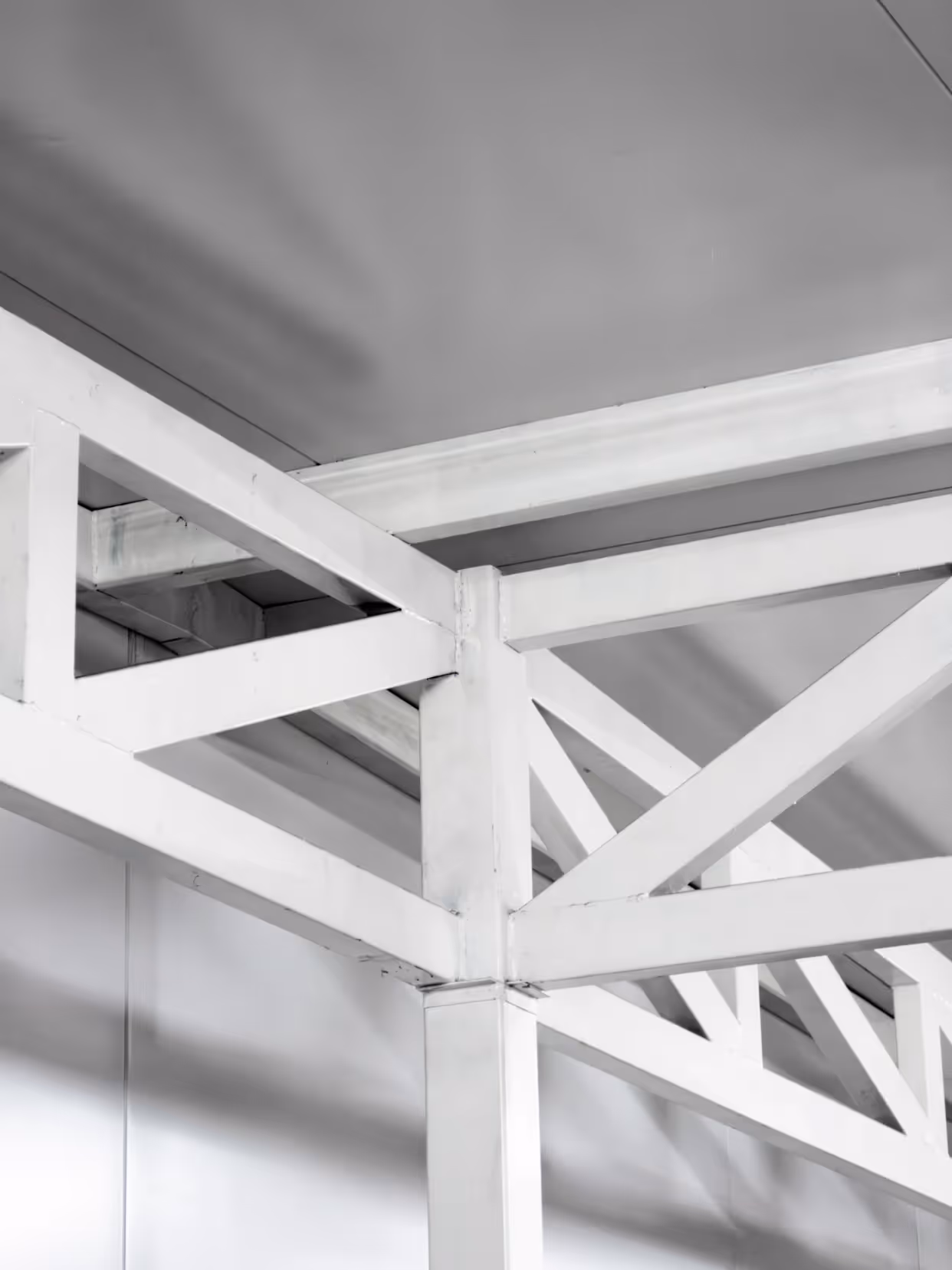
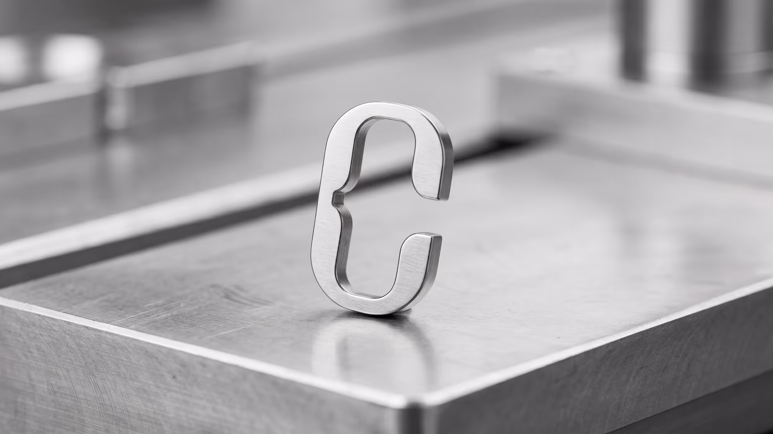
The modular, typographic logo follows the assembly logic inherent in metalwork. The "C" functions as a symbol, and its level of complexity can scale to any medium: fleet, uniforms, plans, signage, stationery. The color palette references the metalworking process: reds and oranges that evoke heat and transformation, contrasted with teal greens that add depth and balance. The system also relies on technical drawing resources, such as grids, lines, and structures.
Result
An identity that organizes and makes visible Colperf's working methods, reflecting its precision and years of experience, capable of guiding the process from the initial technical drawing to the finished project.
Credits
Design
Sofía Lasida, Amparo Bengochea da Fonte, Matías Berta, Gabriela Nisizaki
Photography
Martina Espiga García