Context
Lynk Markets builds infrastructure for ETNs, bringing structuring, issuance, distribution and operations into a single system that connects asset managers with wealth managers. After years of growth and proven adoption across the financial sector, the brand had become smaller than the company behind it. The new identity needed to communicate Lynk’s scale and maturity while remaining clear at first glance and precise enough for a highly technical audience.
Strategy
What sets Lynk apart is its ability to connect people, structures and opportunities across the financial system. The idea was already embedded in the name: Lynk. A link. A connection between two points and a subtle nod to the hyperlink, the digital mechanism that makes access immediate. Every link enables something to happen: a transaction moves forward, a product reaches more investors, a new market opens up. Simplifying access. Always pointing forward. From there, we built an identity system where connection is not only the idea behind the brand, but the visual logic that holds it together.
Implementation
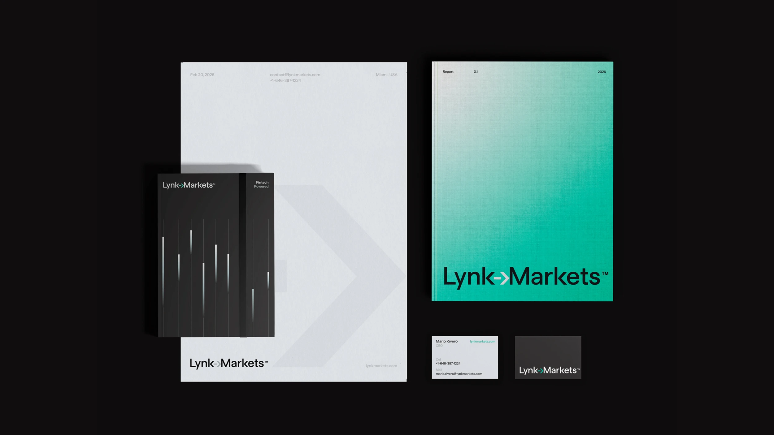
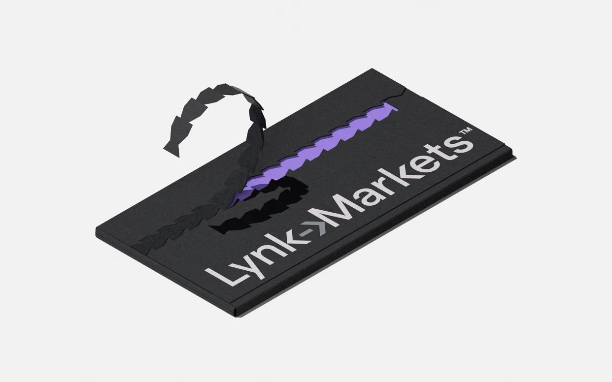
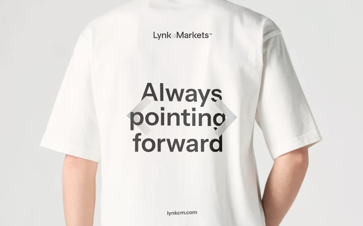
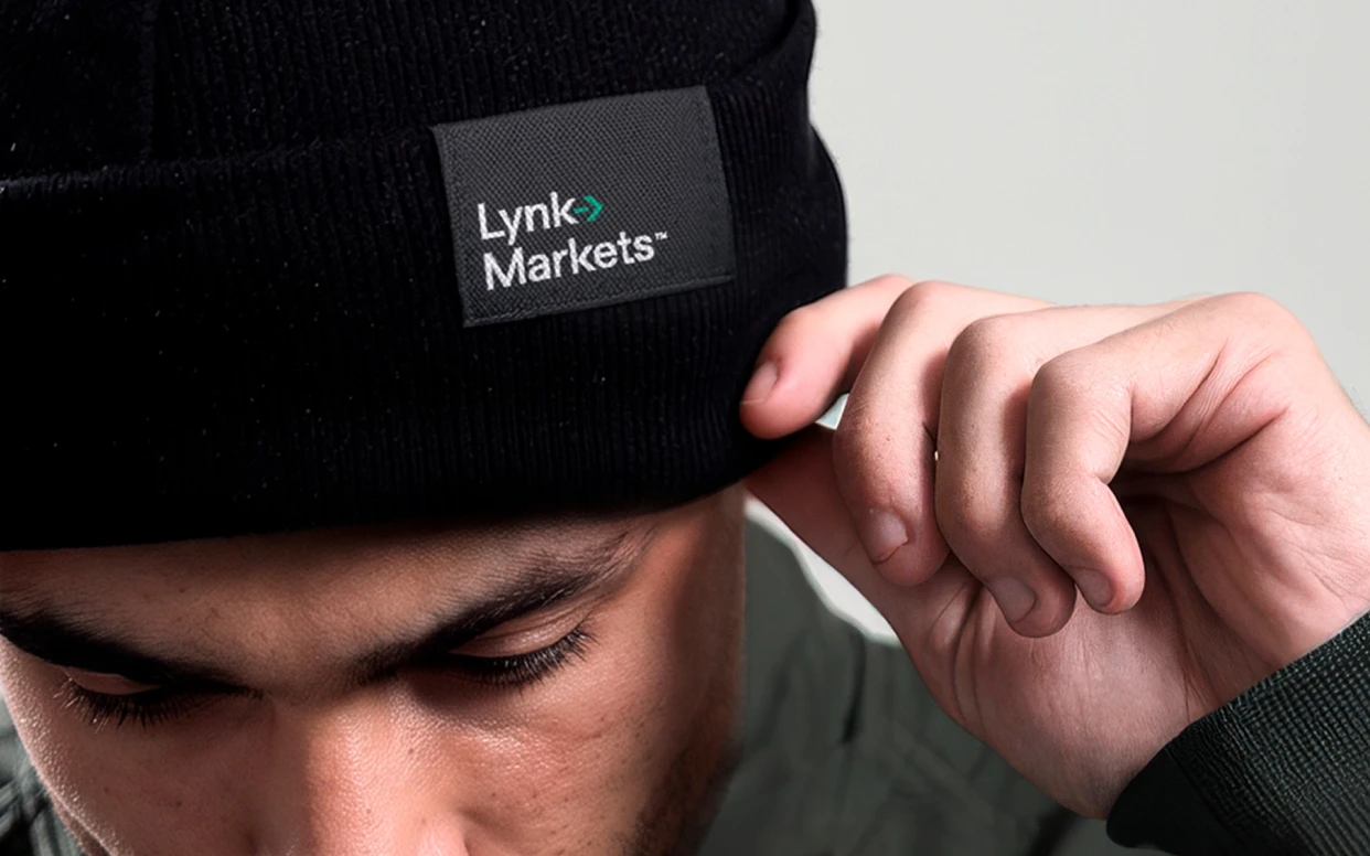
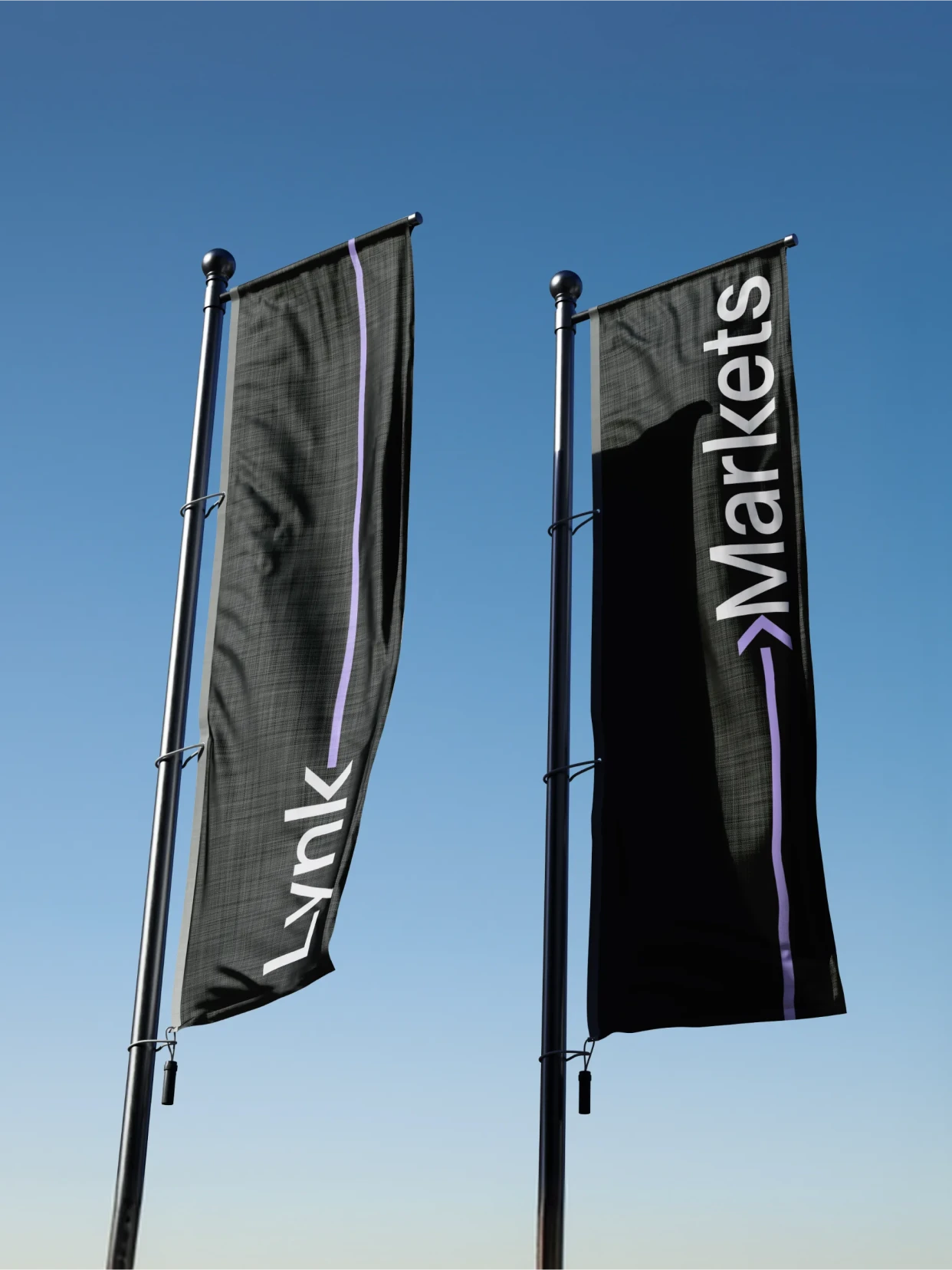
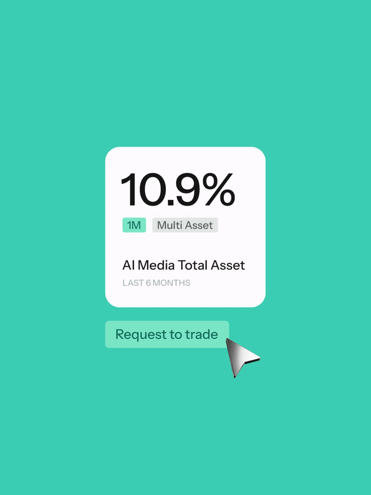
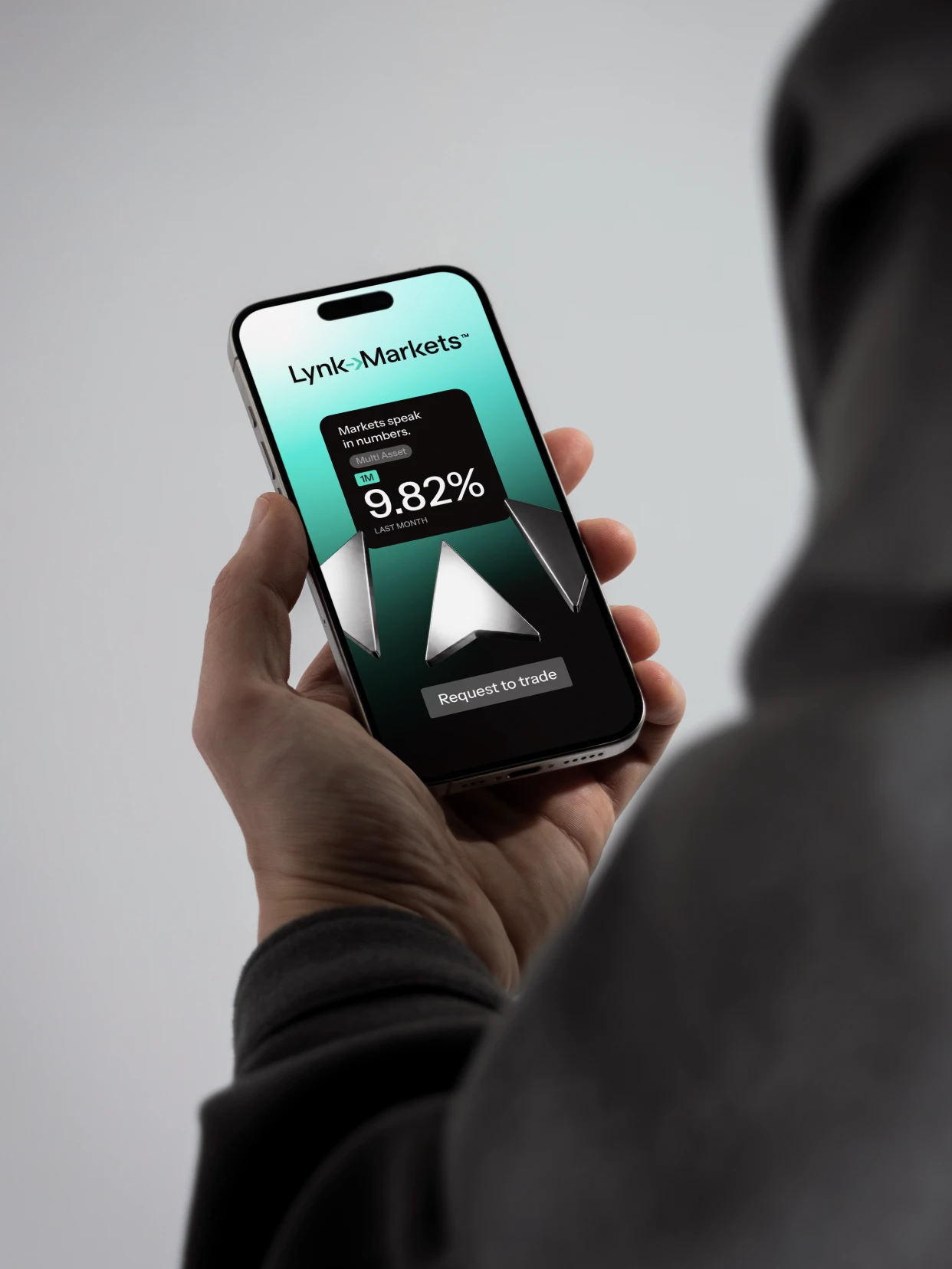
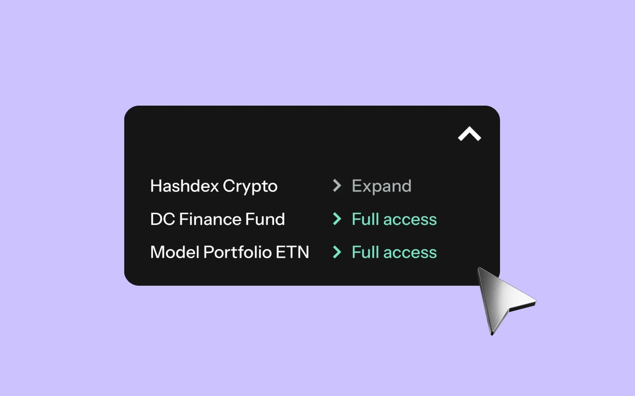
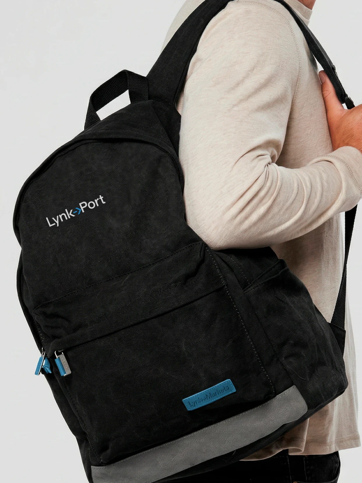
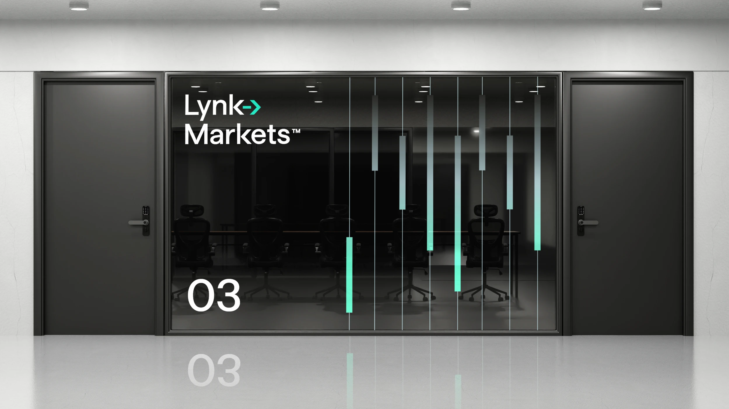
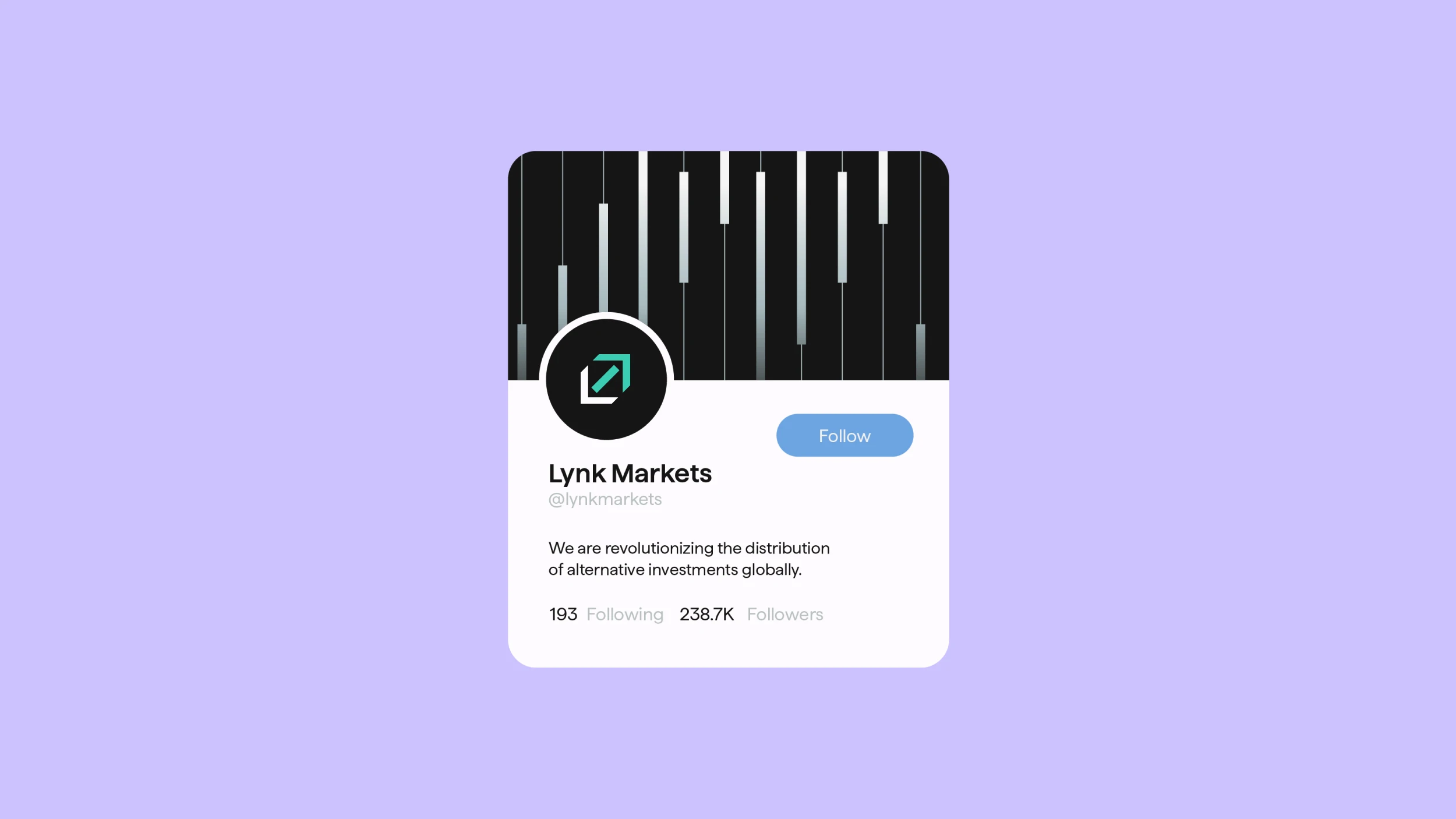
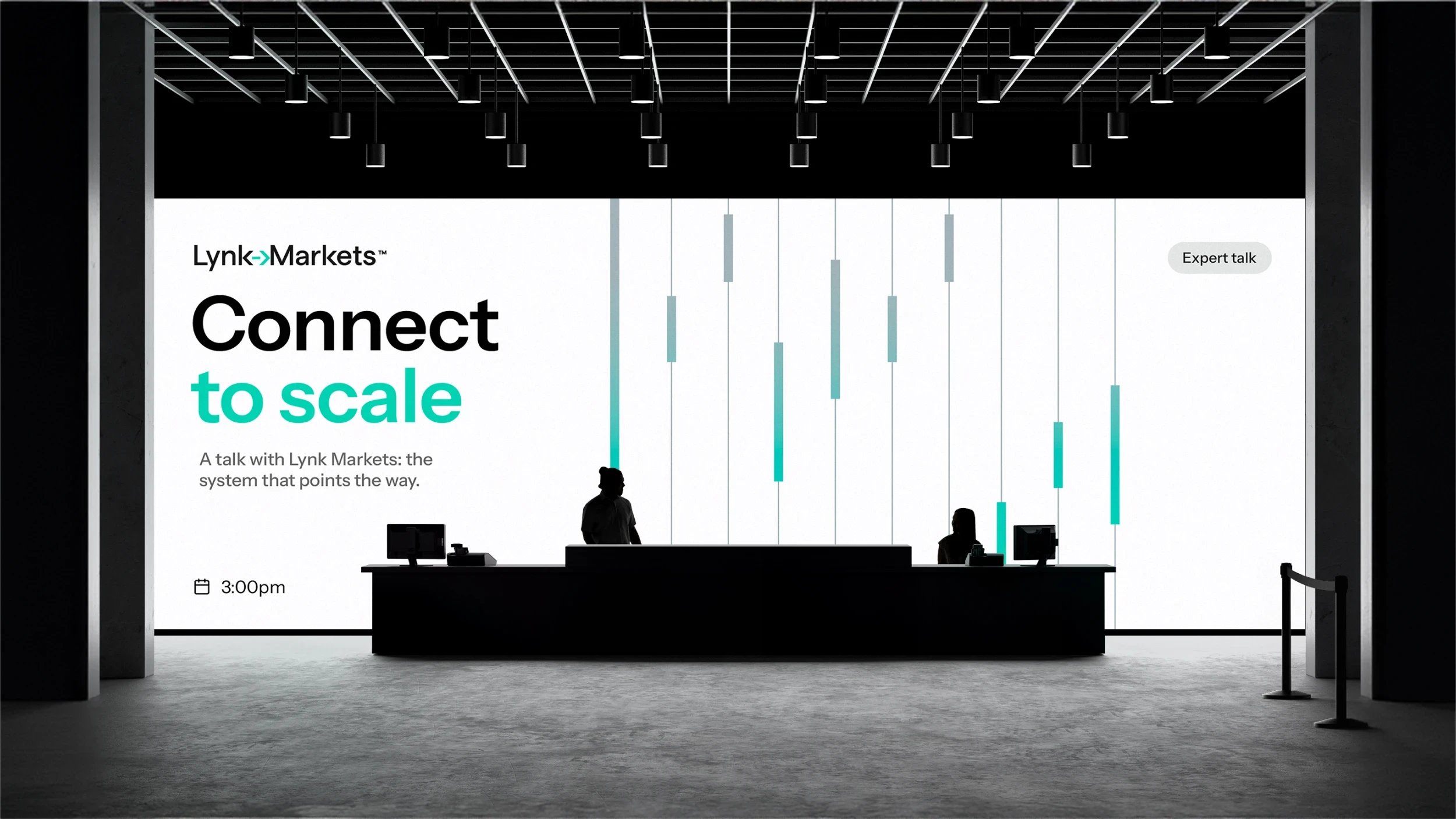
The arrow embedded in the wordmark became the system’s core unit. It connects, guides and points forward. It bends, repeats and expands into a network that brings the different parts of the brand together. The palette combines silver, teal, blue and lilac, bringing depth and distinction to a traditionally restrained financial landscape. The system was rolled out across Lynk’s key touchpoints, including its new website, stationery, presentations, merchandise and more.
Result
An identity that makes Lynk Markets’ role within the financial ecosystem visible: connecting infrastructure, products and people to simplify access to alternative investments. A clear, distinctive and flexible system, built to grow with the company as it expands into new products, audiences and markets, always pointing forward.




Credits
Design
Matías Berta, Amparo Bengochea da Fonte, Sofía Lasida, Lucía Fuentes,
Strategy
Beatriz Fernández, Gabriela Nisizaki
Motion
Matías Berta
Web
Valentina Vaccotti