Context
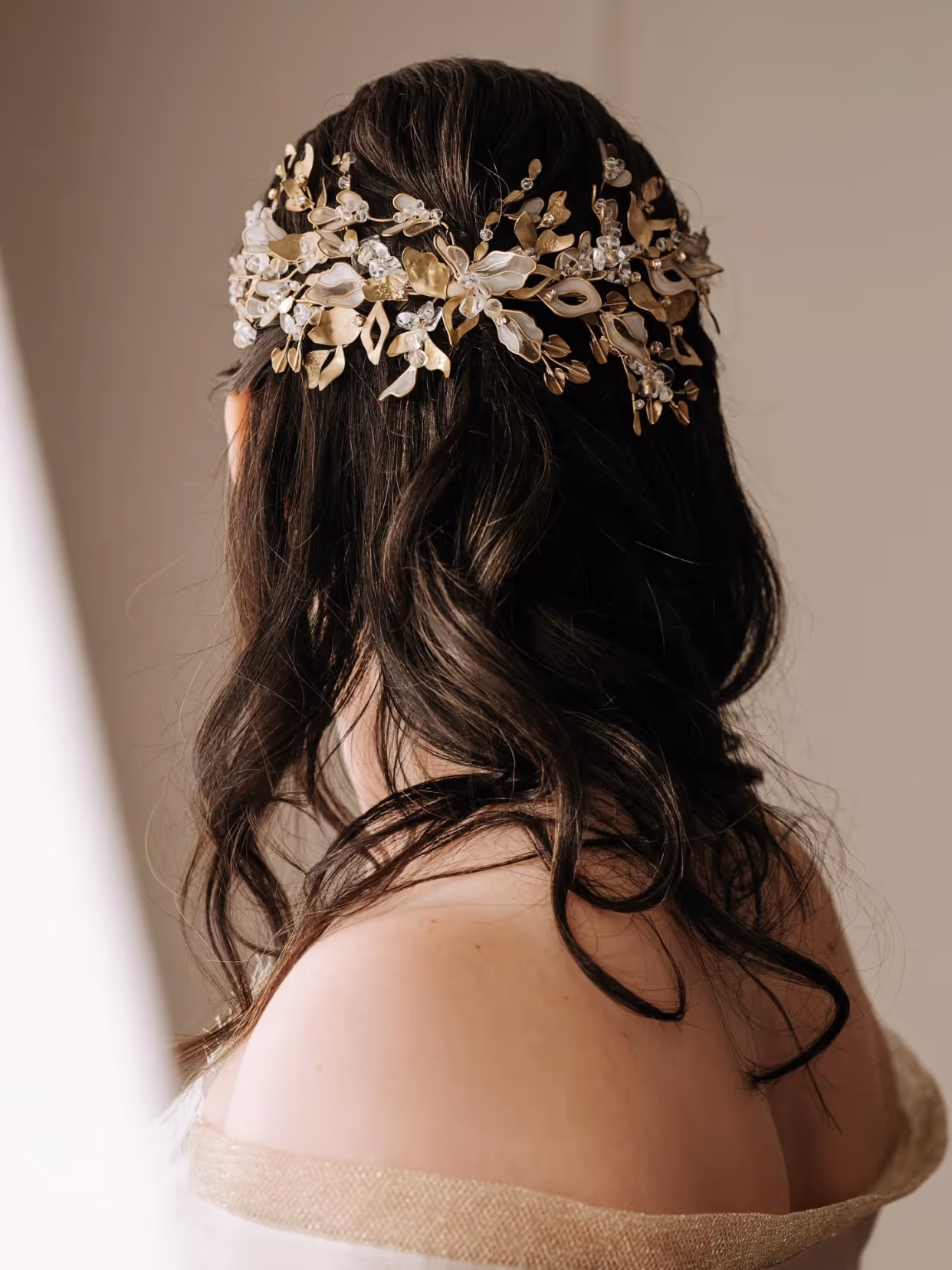
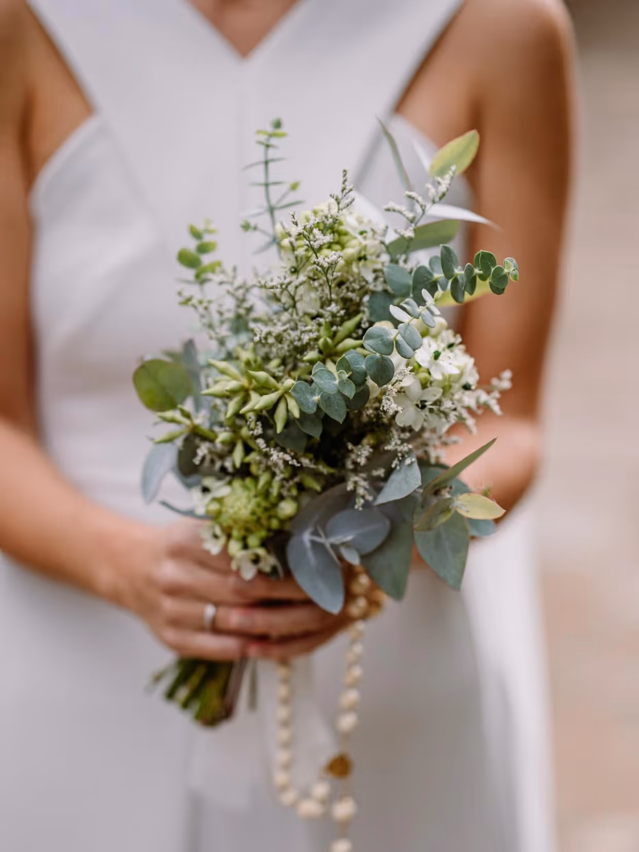
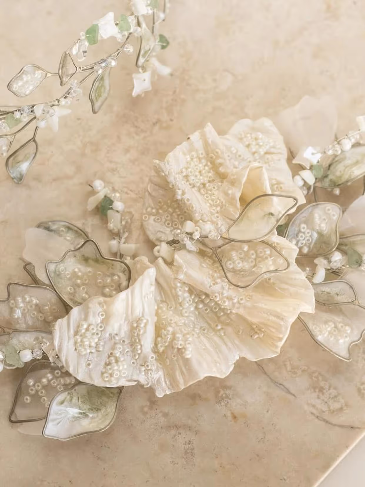
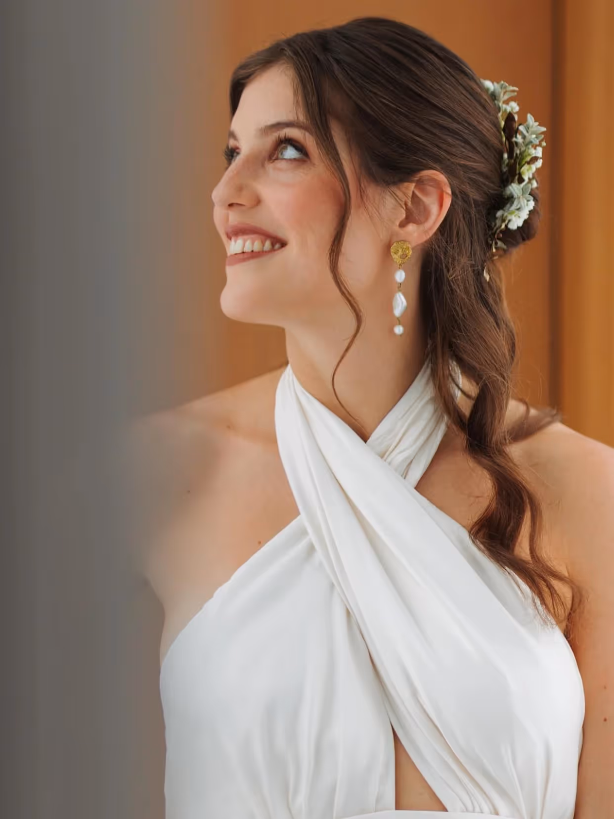
Inés Carriquiry started making headpieces as a hobby in 2015. Over time, the craft became her profession. Today she creates handmade headpieces and jewelry, primarily for brides, with a precision built over years of practice. She needed an identity equal to that: artisanal without being rustic, elegant without being cold.
Strategy
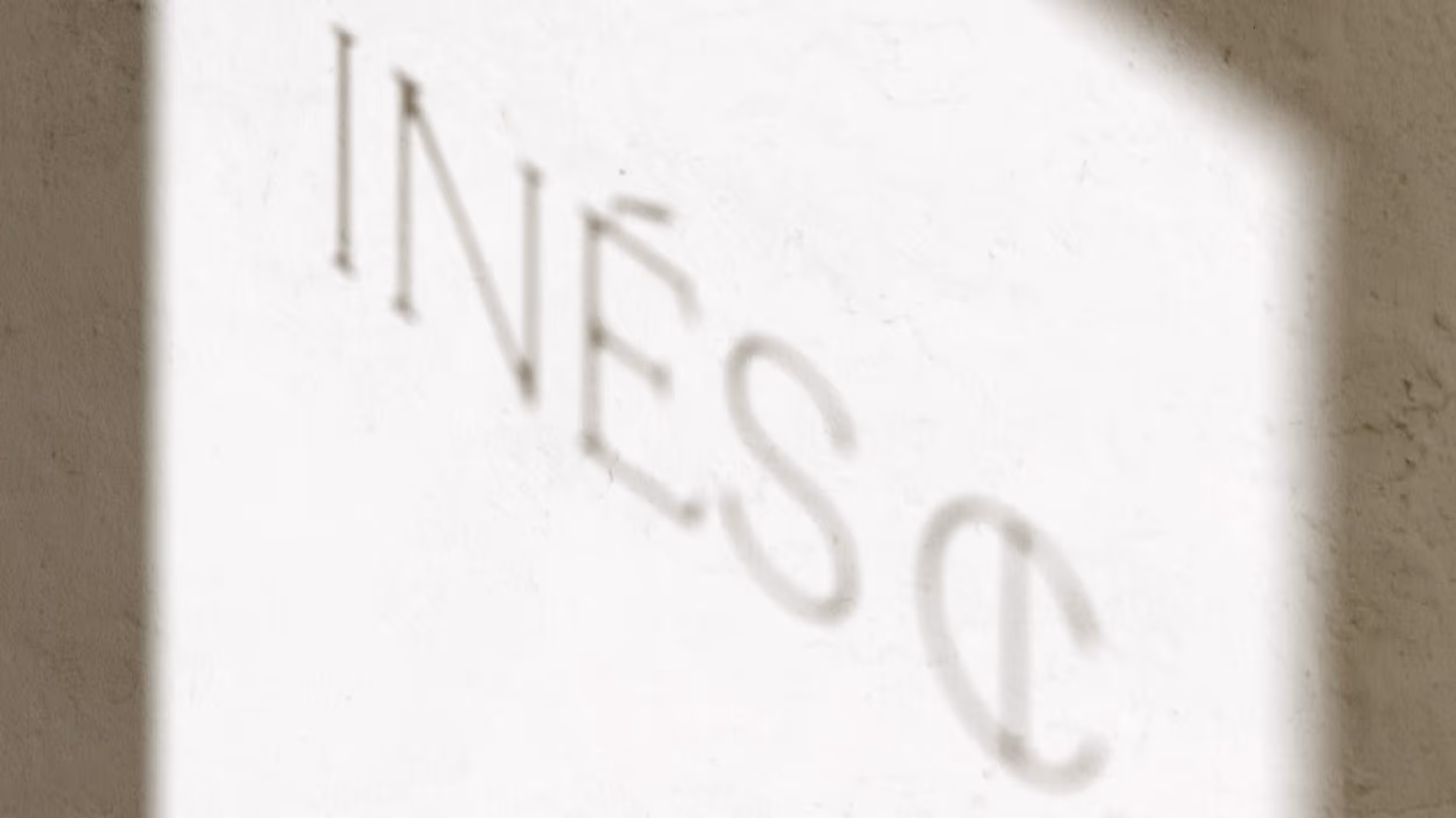
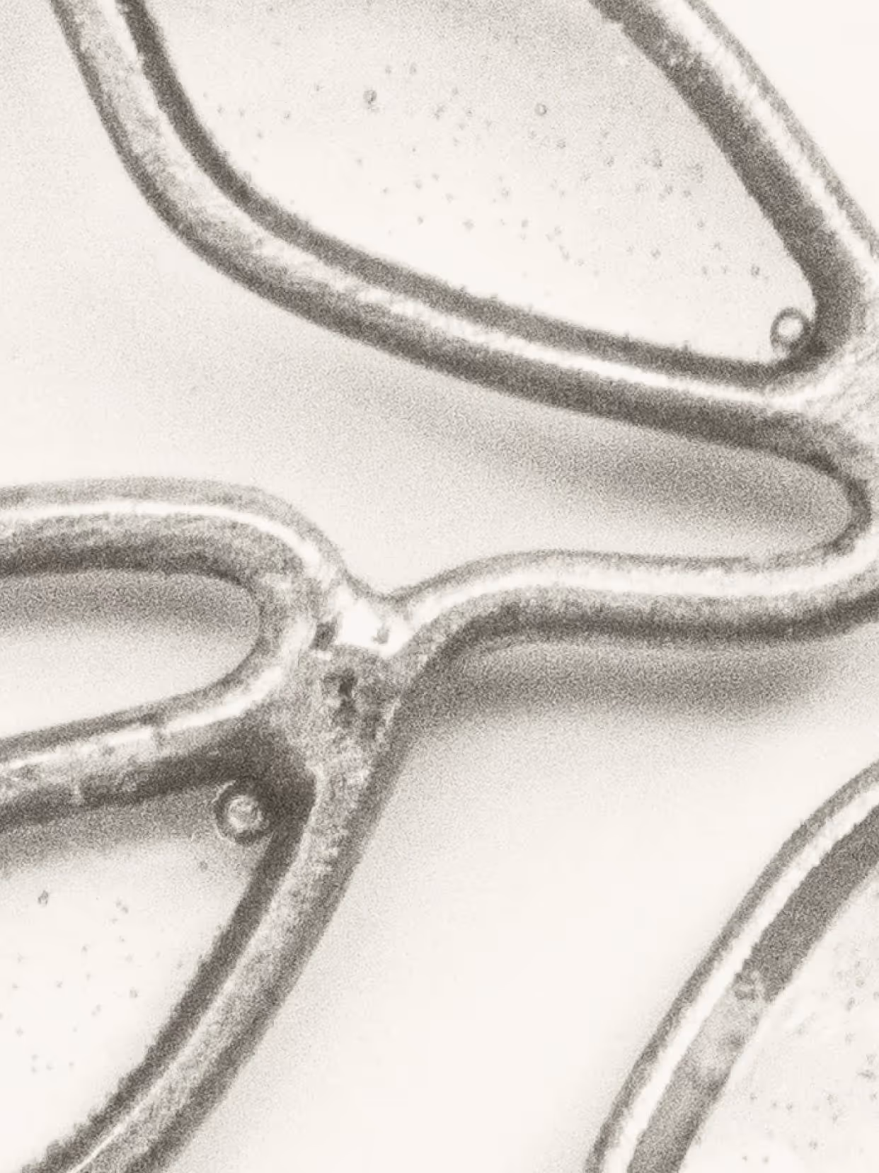
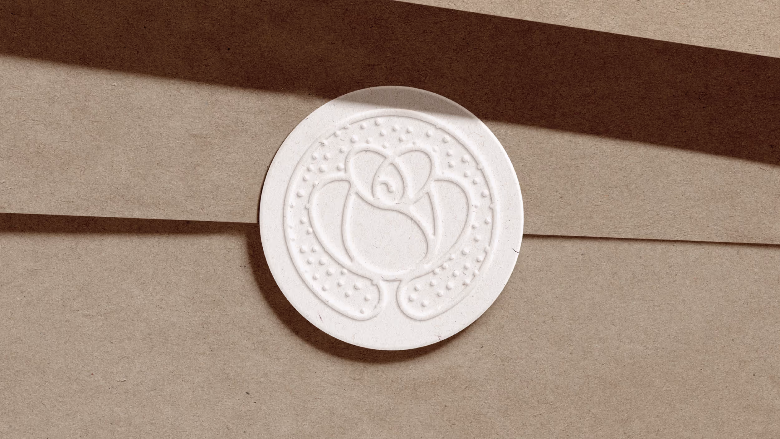
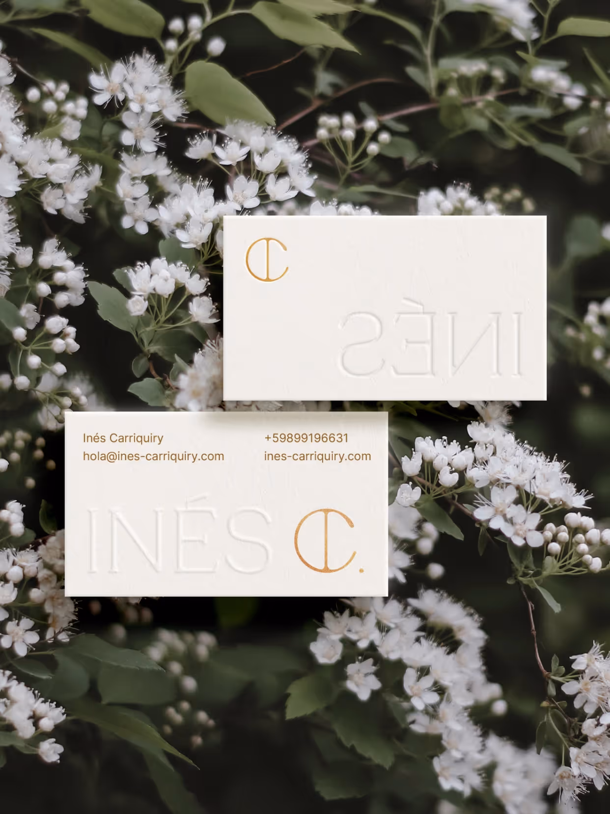
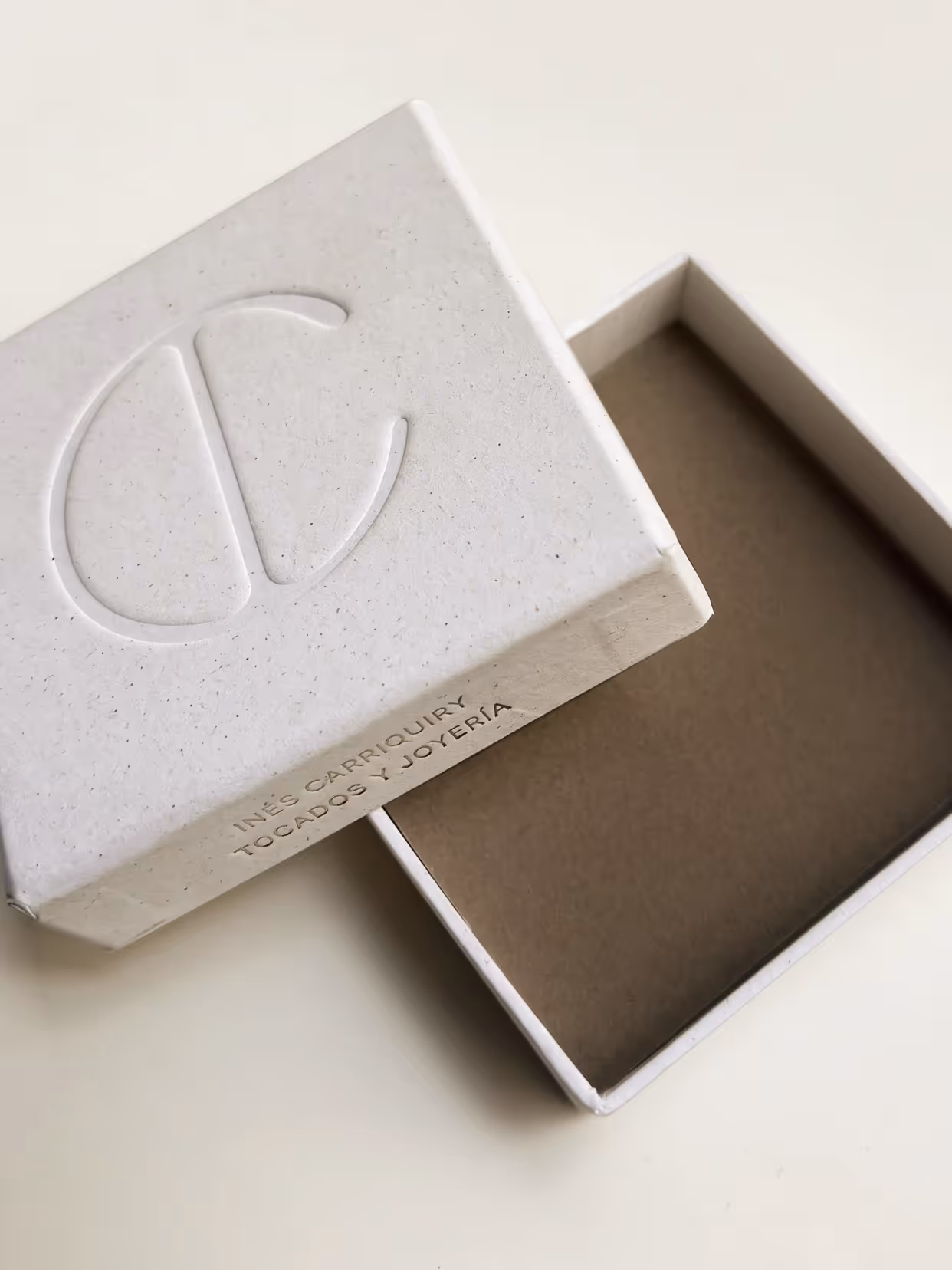
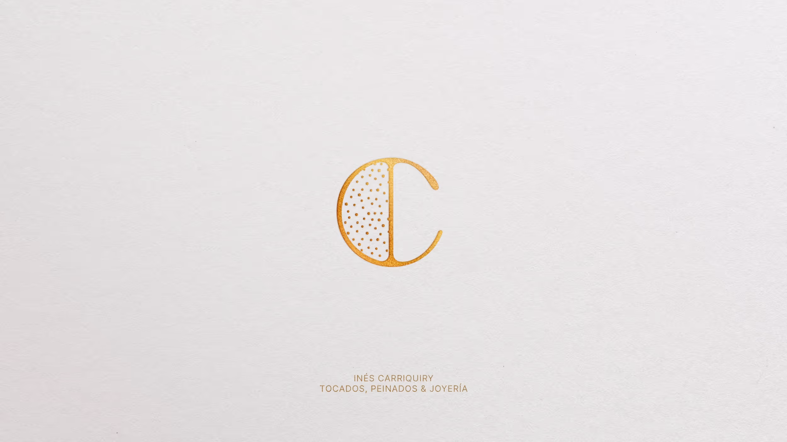
The morphological origin of the identity lies in the solder joints of cast jewelry, where metal meets and fuses. Those joints translated into a typographic system with expanded letterforms and connections that evoke the craft. An identity built from the technique itself.
Implementation
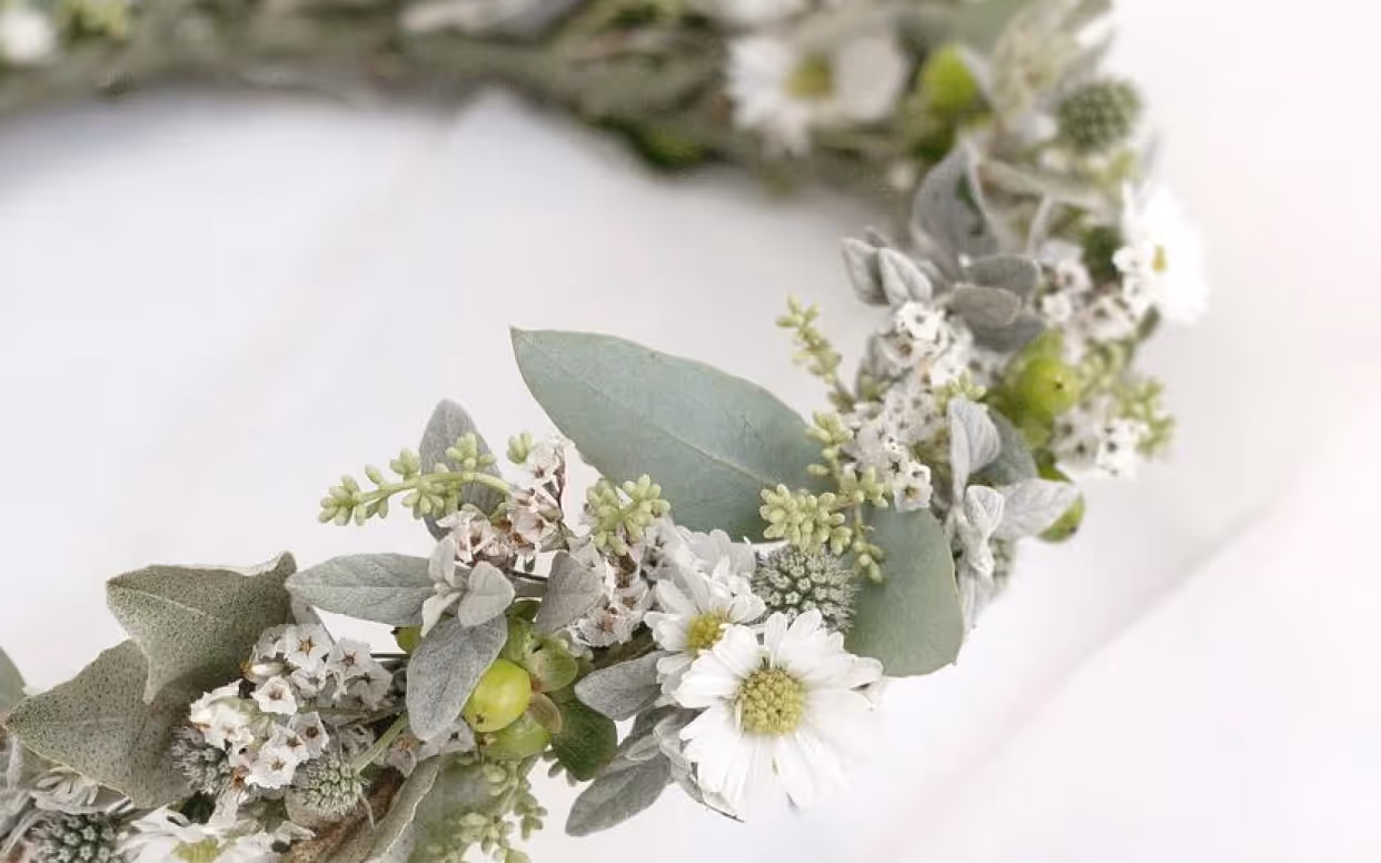
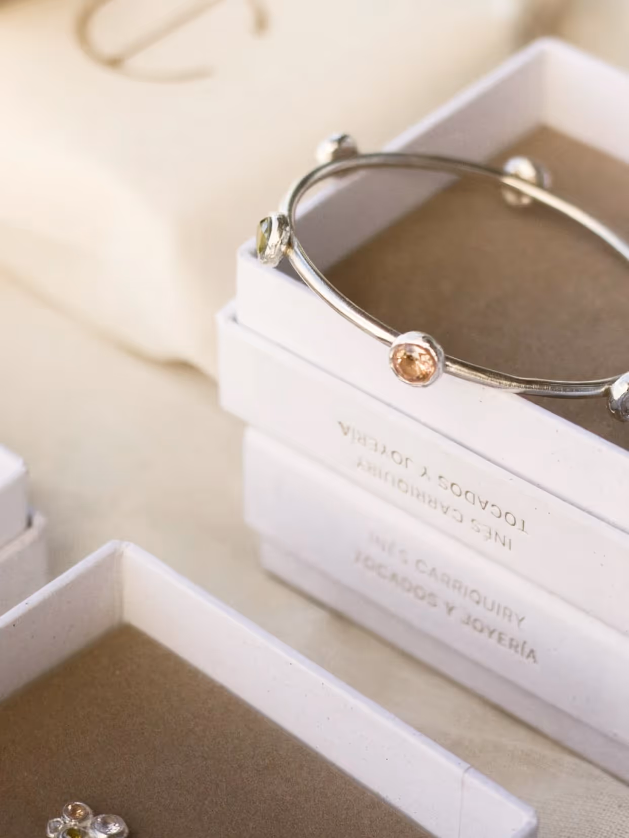
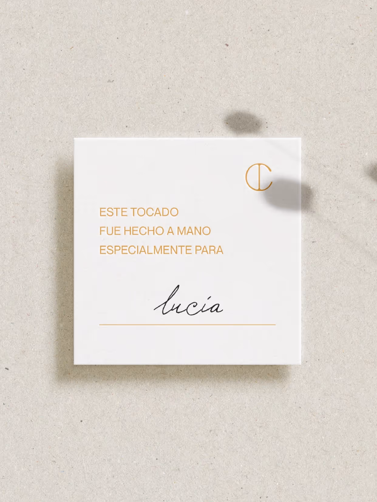
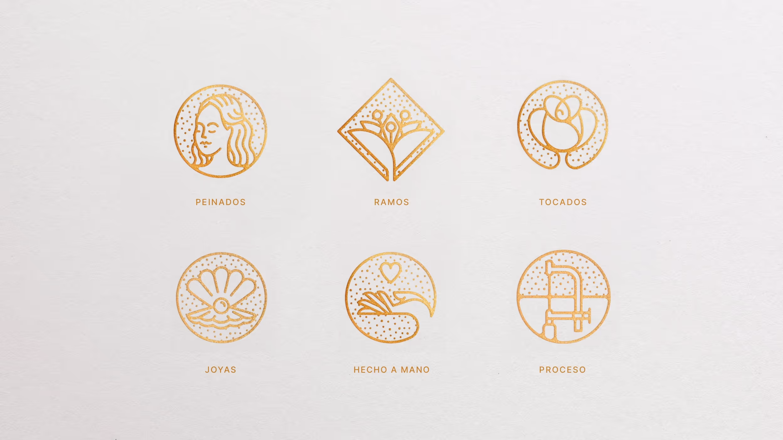
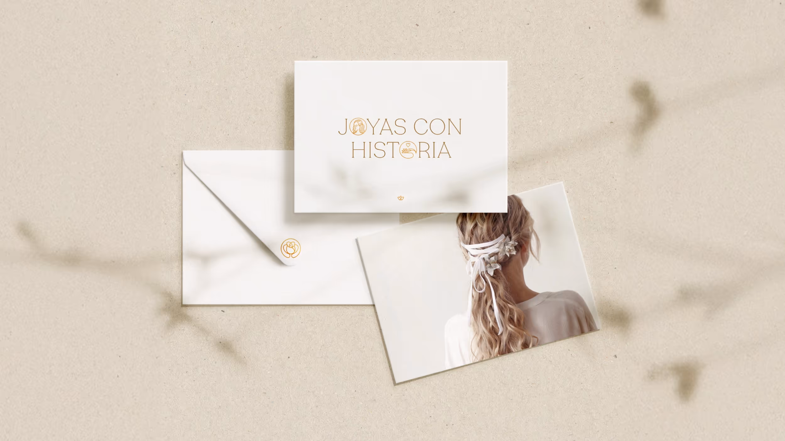
A palette of gold, beige, and neutrals, with sage greens and mauves as support. Santral as the primary typeface. An icon set that codes Inés's range of services: headpieces, jewelry, hairstyling. Designed for a woman between 25 and 35 with a refined aesthetic sensibility who chooses handmade because she values the detail. The identity accompanies unique pieces without overshadowing them.
Result
A system that integrates design, play, and functionality, maintaining a clear and recognizable identity across all applications.
Credits
Design
Gabriela Nisizaki
Photography
Estudio Moreira, Patricia Riba, Boffano Studios, Inés Carriquiry